• Welcome to ZD Forums! You must create an account and log in to see and participate in the Shoutbox chat on this main index page.

Sabel27's GIMP Creations

AllieHaxorNova

Nine Tailed Hannya.
Joined
Feb 25, 2011
Yes I agree with Linknerd. even though I did not request anything, you do a lovly job for the other people who do want a sig or avy. For that I give you rep :D
 

Sabel27

Advanced Ocarinaist
Joined
Mar 29, 2011
Location
Hyrule, where else would I be?
Sabel, They are amazing! thank you! I was speechless when I saw them. Thank you!:D

Anytime! :D I am glad you like them!
Oh, and P.S. It is Sabel27 ;)

Yes I agree with Linknerd. even though I did not request anything, you do a lovly job for the other people who do want a sig or avy. For that I give you rep :D

Thank you! It is always nice to get rep!
 

tecknokid900

All Hail Yhtomit!
Joined
Mar 6, 2011
Location
The Lost Woods
I'd like to have a request please, If it is'nt too much trouble, I'd like you to improve my avatar. I feel it can be so much better, and I don't know how to GIMP, so if you could do it that would be great! I don't know what can be done with it, so if you want to expeirament, go ahead. Heres the Link to my pic : http://i.imgur.com/ciaGA.png
 

Sabel27

Advanced Ocarinaist
Joined
Mar 29, 2011
Location
Hyrule, where else would I be?
I'd like to have a request please, If it is'nt too much trouble, I'd like you to improve my avatar. I feel it can be so much better, and I don't know how to GIMP, so if you could do it that would be great! I don't know what can be done with it, so if you want to expeirament, go ahead. Heres the Link to my pic : http://i.imgur.com/ciaGA.png

Yeah, I can do that. I will get on it soon. Are there any specifics that you want me to add?
 

tecknokid900

All Hail Yhtomit!
Joined
Mar 6, 2011
Location
The Lost Woods
Not really, I would just like to see How much cooler you can make it, I made on paint originally. Maybe if you want/can you can make it look real.
 

Sabel27

Advanced Ocarinaist
Joined
Mar 29, 2011
Location
Hyrule, where else would I be?
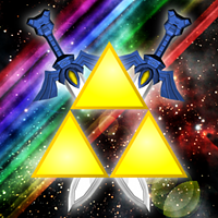
Here is your new avatar Tecknokid900!


TriforceAvatarTecknokid900.png


http://i1237.photobucket.com/albums/ff470/Sabel27/TriforceAvatarTecknokid900.png

Tell me if there is anything that needs changed!
 

Sabel27

Advanced Ocarinaist
Joined
Mar 29, 2011
Location
Hyrule, where else would I be?
OMG!!!!!! PERFECT!!!!!! Thanks a lot!!
Hmm, Jw but could you show the swords inside the triforce? Just so I can see it. Thanks

I had to erase the part of the blade that was inside the Triforce because it didn't look right to me. It was covering up the empty part and the Triforce didn't really look like...well...the Triforce! That is why I had to erase it. So, I really don't have a picture saved of what it looked like before. I hope that's okay!
 

David

But you called me here...
Joined
Aug 6, 2010
You're doing a pretty darn good job, and for that, I congratulate you.

However, you can still get better, as most all of us can. First off, I'd suggest you take a look at the Resource Thread that I've posted, if you haven't already. There are some great things in there that can help you out, by both providing you with tutorials and items that can improve your work. Secondly, as a general comment, you could use some work on your lighting. With lighting, you can add some really cool depth to your art, which can improve how it looks and flows. It also might be worth it to take a look at some text placing tutorials for your signatures.

I hope that this information is helpful, because I do not mean to hurt or put you down in anyway. As a signature artist, I strive to improve the quality of the art on these forums, because I feel that a place like this deserves to have awesome graphics.

Good luck with your further creations, and if I can help at all, feel free to message me.
 

tecknokid900

All Hail Yhtomit!
Joined
Mar 6, 2011
Location
The Lost Woods
I had to erase the part of the blade that was inside the Triforce because it didn't look right to me. It was covering up the empty part and the Triforce didn't really look like...well...the Triforce! That is why I had to erase it. So, I really don't have a picture saved of what it looked like before. I hope that's okay!

Ah ok, I understand. It looks great though! and I thank you very much for it! :)

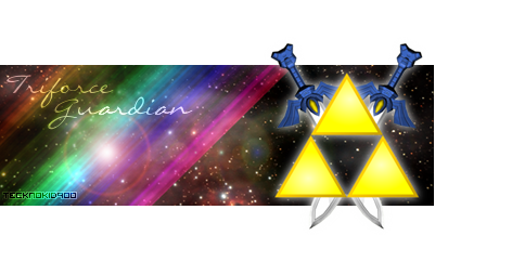
Hey! I just got an Idea! Sorry if I'm bothering you more. Could you make my avatar larger and Place it in the middle of the pic for a Signature? And then on the left put the words : Triforce Guardian" and on the right of it : Tecknokid900? If you could I would be really grateful! Thanks.
 

Sabel27

Advanced Ocarinaist
Joined
Mar 29, 2011
Location
Hyrule, where else would I be?
You're doing a pretty darn good job, and for that, I congratulate you.

However, you can still get better, as most all of us can. First off, I'd suggest you take a look at the Resource Thread that I've posted, if you haven't already. There are some great things in there that can help you out, by both providing you with tutorials and items that can improve your work. Secondly, as a general comment, you could use some work on your lighting. With lighting, you can add some really cool depth to your art, which can improve how it looks and flows. It also might be worth it to take a look at some text placing tutorials for your signatures.

I hope that this information is helpful, because I do not mean to hurt or put you down in anyway. As a signature artist, I strive to improve the quality of the art on these forums, because I feel that a place like this deserves to have awesome graphics.

Good luck with your further creations, and if I can help at all, feel free to message me.

Thanks! I took a look at the resource thread and it has a lot of great tutorials on it! I will definitely be sure to take a look at that thread a lot! Thanks again for all of the help!
 

Users who are viewing this thread

Top Bottom