- Joined
- Jan 22, 2011
You are using an out of date browser. It may not display this or other websites correctly.
You should upgrade or use an alternative browser.
You should upgrade or use an alternative browser.
Ocarina of Time NEW Ocarina of Time 3D Screenshots!!
- Thread starter jejaynes15
- Start date
More options
Who Replied?- Joined
- Nov 30, 2009
Graphics still are being worked on it looks like, and that ingo still looks like hes the N64 one..
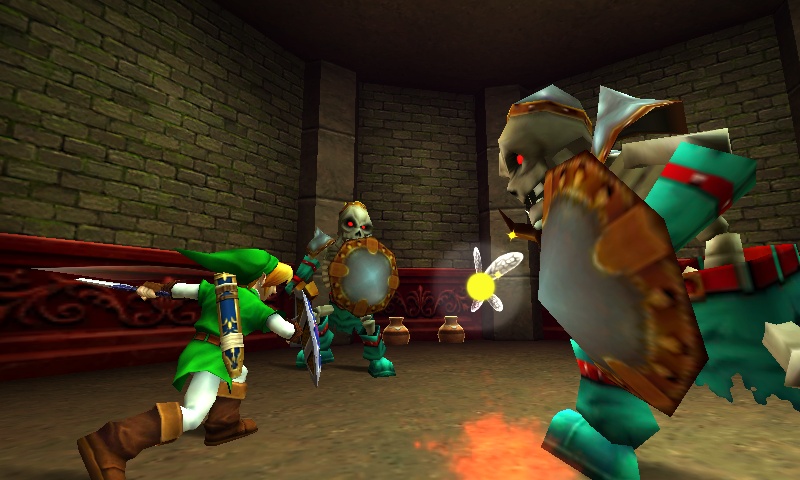
The pots behind the stalfos have weird outlines
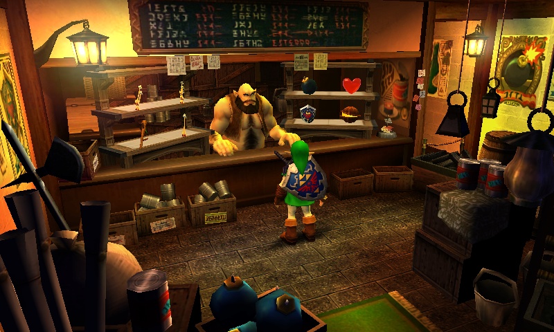
The shop looks super cluttered, easy to steal things, xD
The pots behind the stalfos have weird outlines
The shop looks super cluttered, easy to steal things, xD
Stallord
Twilit Fossil
- Joined
- Jan 10, 2011
- Location
- Arbiter's Grounds
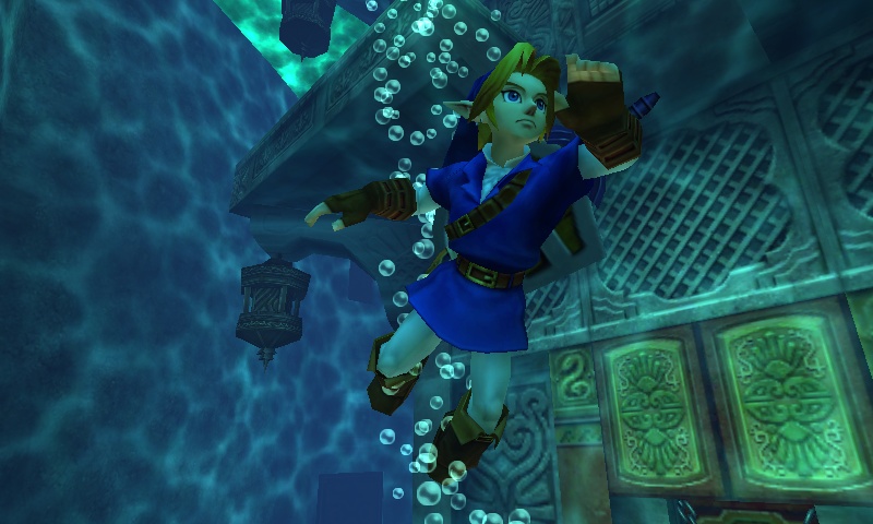
NOOOOOOO!!!!! NOT A WATER TEMPLE PICTURE!!!!!!
loljk. That temple did annoy me, though. And it looks like it will still have multiple stories...
I have a feeling the graphics are still in the works. They're a lot smoother, but they still look like what they did in the original OoT.
loljk. That temple did annoy me, though. And it looks like it will still have multiple stories...

I have a feeling the graphics are still in the works. They're a lot smoother, but they still look like what they did in the original OoT.
MoblinPiglet
Prince of Moblins
- Joined
- Jun 17, 2010
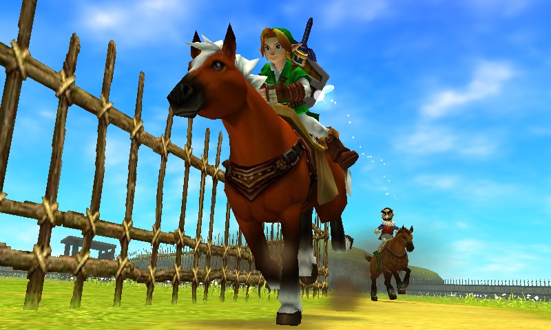
You can tell the fences still need a little bit of work. Lol
LolGames4U
Viceroy of Area 11
- Joined
- Dec 24, 2010
- Location
- USA
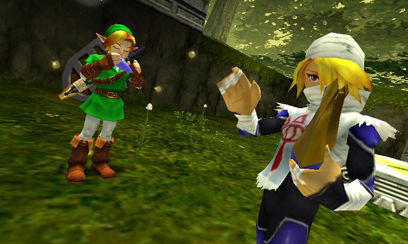
Those look amazing! Sheik looks so good! And the detail! WOW!
green goron
Best of the Gorons
- Joined
- May 15, 2010
- Location
- Death Mountain
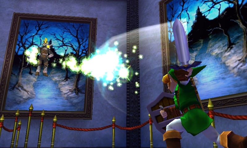
I really like the 3d effect in the Phantom Ganon picture. The fences and pots still need some work. I'm sure the graphics are still being worked on and already the water temple has a picture. Goooood times.
OcarinaSword
Never Give up
- Joined
- Feb 23, 2011
- Location
- Home.
Wow i love them there awsome i see the graphics have changed a lot i love them!
EternalNocturne
Fluffy hair!
- Joined
- Jun 15, 2010
- Location
- Skyloft
After all these years, Link still has his trademark Ocarina of Time... uh, frown. XD You never see him smile until very late on in the game...
They look amazing though!
They look amazing though!

blubb
Ash Gala Wonderful!
- Joined
- Mar 9, 2010
- Location
- 49.9°N 8.2°E
Yeah, it's really obvious that the graphic development is just in full progress. Many things have been revamped a lot (especially the shop but also nearly everything in the Phantom Ganon room) while other things aren't finished yet (the fence on the ranch, Epona, the pots). It'll look great when it's all done!
Hero Of Spirits
Champion of Cyrodiil
- Joined
- Feb 25, 2010
- Location
- Cyrodiil, Tamriel
Well, I've gotta admit, they HAVE done a slight overhaul on Oot 3DS's Link's face. Looks better in my opinion. This does look very promising, I can say they still have a fair bit to go to do.
Turo602
Vocare Ad Pugnam
- Joined
- Jul 31, 2010
- Location
- Gotham City
I just realized. Is Sheik playing a harp? And didn't we just find out that Skyward Sword will have a harp? You see were I'm going here.
But back to Ocarina of Time 3D. It looks amazing but a bit cartoony and still needs some work as you can see. I like how it's all coming along nice with the Link model and other people and places. This will certainly put some more life into Ocarina of Time for me. I'm still wondering what the Zelda 25th Anniversary project is about? Total Zelda overload today. But still not enough for me!
And also, am I the only one to have not found the Water Temple annoying? When I played it for the first time I seriously didn't have a problem with it. If anything I think I found the one it Twilight Princess a bit more annoying and a bit more boring.
But back to Ocarina of Time 3D. It looks amazing but a bit cartoony and still needs some work as you can see. I like how it's all coming along nice with the Link model and other people and places. This will certainly put some more life into Ocarina of Time for me. I'm still wondering what the Zelda 25th Anniversary project is about? Total Zelda overload today. But still not enough for me!

And also, am I the only one to have not found the Water Temple annoying? When I played it for the first time I seriously didn't have a problem with it. If anything I think I found the one it Twilight Princess a bit more annoying and a bit more boring.
AwesomeTingle
Pure Awesomeness
- Joined
- Aug 3, 2010
- Location
- Somewhere over the Rainbow
Great! Except the fence, that still looks like one of those paper thin props that are just for looks.. The thing is, now with the 3DS, screenshots will never be as good as when you are actually playing the game, cause the screenshots aren't 3d! Great job finding these awesome pics!
P
Peacelovekid
Guest
Everything is looking amazing so far. I really love the photo of the shop especially, it's incredibly detailed! If you've seen the IGN gameplay, you know how smooth this game runs. It's a little weird to say this, but this 13-year-old game is my most anticipated 3ds release.
- Joined
- Jan 22, 2011

Here is the official logo
and here is a comparrison of the shop from the N64 to the 3DS. I found this comparison at the Nintendo 3ds Forums.
The detail from 64 to 3DS is obviously amazing! I cannot wait until June!

N64:

3DS:

Blazestarre
*Insert title here*
- Joined
- Feb 9, 2011
- Location
- Midwestern US
The game looks amazing so far! The details that have been added to the background are great. I love the shop. It actually looks like a shop that people would go in and buy something. Seeing the shots of the dungeons really makes me excited. Even though the graphics were amazing at the time, some of the dungeons in OoT always made me feel uneasy about how much they lacked small details in various rooms, mostly in the Fire Temple and Water Temple. I know it's being picky, but I always felt that most rooms just had enough objects placed in them to create a puzzle. It looks like OoT 3D is really going to add some atmosphere to the dungeons.
And the shield! That's one thing that I never liked in the game. The shield looked like an ugly polygon with a few shapes plastered on. It always appeared lazy to me. Now it actually looks like a shield!
And the shield! That's one thing that I never liked in the game. The shield looked like an ugly polygon with a few shapes plastered on. It always appeared lazy to me. Now it actually looks like a shield!

Users who are viewing this thread
Total: 2 (members: 0, guests: 2)

