• Welcome to ZD Forums! You must create an account and log in to see and participate in the Shoutbox chat on this main index page.

Graphics: Skyward Sword Vs. Twilight Princess.

Graphics: Skyward Sword Vs. Twilight Princess.

  • I Prefer The Graphics Used In TP.

    Votes: 0 0.0%
  • I Prefer The Graphics Being Used In SS.

    Votes: 0 0.0%

  • Total voters
    0
Joined
May 8, 2010
Location
Eagle River, Alaska
The graphics could become more realistic, they did it with Twilight Princess as it was orginally going to be a sequel to Wind Waker, but this is very unlikely because they're so far in development.
 

Jupiter

Bringer of Jollity
Joined
Jan 24, 2010
Location
Great Lakes
A comparison of WW/TP/SS - Check this out!

tpsswwcomp2.png


tpsswwcomp.png
 
L

lanceyllek

Guest
hi im new to the site and im huge zelda fan and it may just be my fan boyness kicking in but i think that its the best zelda has ever looked i love the combination between TP and WW. Zelda tp's graphics at the time were good but just did not seem to hold up to me it seemed like they got dated really fast and i did not care for the dark gritty look to it i prefer the much more bright colorful look. but hey don't get me wrong i love zelda tp just it was not my fav. but hey thats just how i feel
 
T

The Hero

Guest
This is not cel-shading everyone. It's a painterly look. I heard it was like Impressionism. Look it up!!! As far as the graphics being superior it is superior for this title. The creator said they tailor the graphical art style to the story. Not the other way around. We could see Zelda games in the future with a dark eerie feel like past zelda games. I just hope there's more detail put into the final product with the lighting and some objects.

So is the Graphics better? I'd say for this game yes.
 

43ForceGems

Quid est veritas, Claudia
Joined
Feb 9, 2010
Location
Magicant
A comparison of WW/TP/SS - Check this out!

tpsswwcomp2.png


tpsswwcomp.png

Okay, that's really cool. And so are all the other images that you left a link too. It really shows how SS is just TP but with brighter colors and a more painted feel.
On with this, I prefer TP graphics just because they're really really realistic and SS is just cool. I was actually disappointed when SS's graphics were revealed. The words that came from my mouth were, "What? This is the graphics?!" And I was mad about it all day long. Eventually I got used to it, but I still just prefer TP. WW, now that's awesome graphics (his head is bigger than his body for crying out loud :P! ).
 

Hylian Pants

Nintendo Wench
Joined
Apr 11, 2010
Location
America's armpit
Okay, I've stated a few times around here already that I'm certainly not the biggest fan of these graphics in comparison to TP, albeit I have warmed up to them. It's just that I'm really not buying this whole "Impressionism" selling point. We have an art style here that claims to derive inspiration from impressionist paintings, but, the only "painterly" thing about the game world is the landscapes, which are beautiful, don't get me wrong. However, in actuality, the stationary parts of the game world are the only parts that can accurately reflect that inspiration. Models that need to be movable like Link and the enemies, end up looking plastic. This is because people, faces, and figures done in classic impressionist paintings are somewhat dark and/ or ambiguous; which obviously wouldn't work when transplanted into the SS world, in terms of artistic cohesion and model mobility and fluidity. This game is cel-shaded... to an extent. We see outright cel shading on the character models but blended brushwork in the scenery. Imo, the art direction on this game didn't have very good footing. Impressionism is, traditionally, an art style meant to capture the feel and atmosphere of a single, fleeting moment in time. I'm not really convinced that it's appropriate in a video game, a realm in which it's the complete opposite; you're there, following the visuals for every moment in time.

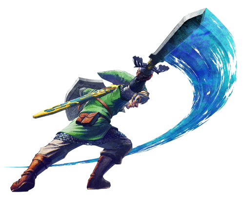
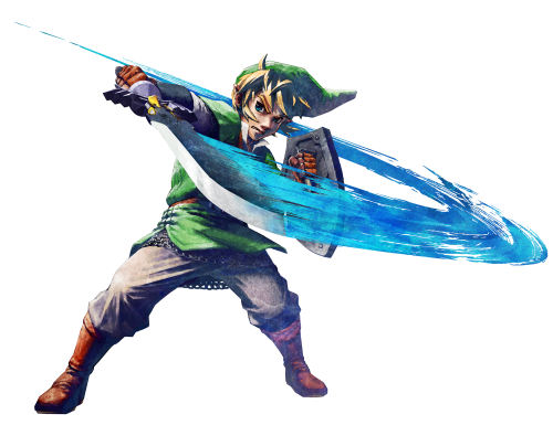
Now, as I also stated elsewhere, the concept art for Link's character model is true to the style the developers meant to replicate. It also even follows the whole "single moment in time" thing I just mentioned.
ssconcept2.png

ssconcept.png


THIS model is much, much more stylized and impressionistic, right down to the fact that he's frozen in movement, swinging his sword. Frankly, I wish Link's in game model was truer to his illustrations, but I understand that that would be an incredibly hard graphic undertaking with a character that needs to be so versatile. I probably like TP better because I felt that the enemies and Link, himself was closer to the environment, they fit better, and the art style flowed correctly between stationary objects, landscapes, and people. All in all, I'm just frustrated that everyone is jumping on the Impressionism bandwagon without dissecting the style a little bit further. It's a nice style on it's own, and it was revolutionary when it came about in the art world in the late 1800's, but I don't think it serves as the best influence for a video game.

I'm also getting sick of using the word "painterly" these days, ugh :S
 
Last edited:

Jupiter

Bringer of Jollity
Joined
Jan 24, 2010
Location
Great Lakes
It's just that I'm really not buying this whole "Impressionism" selling point. We have an art style here that claims to derive inspiration from impressionist paintings, but, the only "painterly" thing about the game world is the landscapes, which are beautiful, don't get me wrong. However, in actuality, the stationary parts of the game world are the only parts that can accurately reflect that inspiration. Models that need to be movable like Link and the enemies, end up looking overly bright and plastic.

I don't think so. I think that the world matches the characters pretty well. Yes, the world has a more dappled look to it, while the characters have more defined lines and colors. But I think the advanced cell shading fits perfectly well within the rest of the world.

I also think you are completely, 100% wrong about it being to bright:

1.) TP was muted and muddy looking. The textures were really tiresome and muddled. The colors in SS are crisp, bold, and well defined.
2.) You are only seeing one area of the game. So that area is relatively brightly colored. There will be dungeons, and caves, and storms, and graveyards, and darker areas.
3.) It is not all that bright. It is not a Care Bears (or Teletubbies) episode. Compare it to WW. It is not nearly as cheery as that. SS has a lot of character.

Don't get me wrong. I think the graphics need a lot of work...the low poly count really bugs me. Fix those trees! And it needs better lighting and particle effects and such. But as a style, I think it is looking good. They just need to find a way to pull it off, which so fare, they are not quite there.
 

Hylian Pants

Nintendo Wench
Joined
Apr 11, 2010
Location
America's armpit
I don't think so. I think that the world matches the characters pretty well. Yes, the world has a more dappled look to it, while the characters have more defined lines and colors. But I think the advanced cell shading fits perfectly well within the rest of the world.

I also think you are completely, 100% wrong about it being to bright:

1.) TP was muted and muddy looking. The textures were really tiresome and muddled. The colors in SS are crisp, bold, and well defined.

I wouldn't describe TP with the word tiresome, I honestly enjoyed the dark, muted look. I'm not saying I would've wanted that same look for SS, but in it's own right, I think it worked. What you say about SS's colors is true, but my issue is that I don't think they style itself meshes as well as I'd like.

2.)There will be dungeons, and caves, and storms, and graveyards, and darker areas.


Yup, yup, that's true.

3.) It is not all that bright. It is not a Care Bears (or Teletubbies) episode. Compare it to WW. It is not nearly as cheery as that. SS has a lot of character.

My bad, I shouldn't have used the word bright as a synonym for plastic-looking. Even though I liked TP's tone, I can also appreciate brightness. If I didn't, I wouldn't be calling SS's landscapes beautiful.
 
L

lanceyllek

Guest
i think it just looks awesome maybe a little rough but still pretty damn good and nintendo said in an interview that they r working on polishing them up so when it comes out it look even better although i think there pretty good now but thats just how i feel. sorry to just but in like this im just really interested as to what people think of the new look
 
Last edited by a moderator:
Joined
Jan 28, 2010
Location
Skyrule
Wow, from the comparrison, Skyward Sword is much more colorful than Wind Waker even. That's awesome! :) Love color!

Really the only thing I think they need to do to make SS's graphics the bomb, is add contrasting shades of the same color in brush stroke textures for the scenery. So the the grass it would have really light, middle, and dark shades of green all blended in a brushstroke style.
 
8

80sfreak85

Guest
What's weird is that we said a lot of negative bashing about The Wind Waker, but look what a great game that turned out to be. Which shows that graphics aren't everything.
 
Z

ZZhobbit

Guest
I personally prefer TP graphics, I'm not saying tech wise they are any better or worse I just like them better, and when I saw the SS moblin I was just like ...wtf? I don't think saying SS is more 'colourful' is a valid argument just because they are going for completely different styles, TP being dark, forboding and OoT like and SS being based on Impressionist art style and the whole Wii is family friendly thing, one could say TP is better because it is darker, not what I'm saying but its just hard to really compare the two when they have no relation.
 

Hanyou

didn't build that
Twilight Princess's style was utterly devoid of any joy or creativity; it looked more like those Western shooters than a genuinely fun adventure game. Even "dark" fantasy sagas like Star Wars and Lord of the Rings utilize a vast array of colors; I would expect no less from a kid-friendly series like Zelda. To top it all off, the textures in TP were muddy beyond believe, and far below the quality I would expect from a flagship Zelda title. Then again, the dreary graphics matched the bland, dreary tone of the game.

While Skyward Sword could use plenty of improvement, the style is much better and the quality of the colors and textures already exceeds Twilight Princess (which isn't difficult in the first place). This hearkens back to classic Zelda, specifically Ocarina of Time, which was rich with color. Thank God it doesn't look like TP.
 

Users who are viewing this thread

Top Bottom