- Joined
- May 8, 2010
- Location
- Eagle River, Alaska
The graphics could become more realistic, they did it with Twilight Princess as it was orginally going to be a sequel to Wind Waker, but this is very unlikely because they're so far in development.

 ! ).
! ).It really shows how SS is just TP but with brighter colors and a more painted feel.
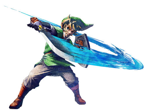
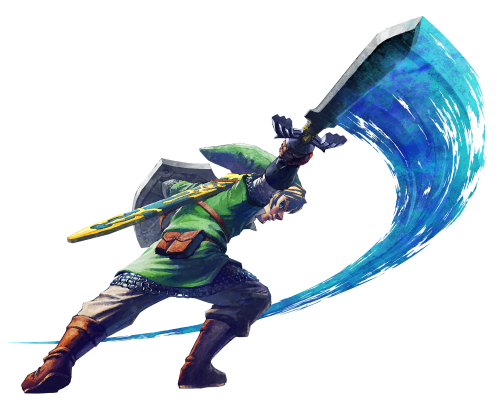
It's just that I'm really not buying this whole "Impressionism" selling point. We have an art style here that claims to derive inspiration from impressionist paintings, but, the only "painterly" thing about the game world is the landscapes, which are beautiful, don't get me wrong. However, in actuality, the stationary parts of the game world are the only parts that can accurately reflect that inspiration. Models that need to be movable like Link and the enemies, end up looking overly bright and plastic.
I don't think so. I think that the world matches the characters pretty well. Yes, the world has a more dappled look to it, while the characters have more defined lines and colors. But I think the advanced cell shading fits perfectly well within the rest of the world.
I also think you are completely, 100% wrong about it being to bright:
1.) TP was muted and muddy looking. The textures were really tiresome and muddled. The colors in SS are crisp, bold, and well defined.
2.)There will be dungeons, and caves, and storms, and graveyards, and darker areas.
3.) It is not all that bright. It is not a Care Bears (or Teletubbies) episode. Compare it to WW. It is not nearly as cheery as that. SS has a lot of character.
 :)") Love color!
Love color!


