
You are using an out of date browser. It may not display this or other websites correctly.
You should upgrade or use an alternative browser.
You should upgrade or use an alternative browser.
The Symbol of Legend of Zelda
- Thread starter SpiritGerudo
- Start date
More options
Who Replied?- Joined
- Apr 4, 2012
I'd definitely say the triforce. Nothing else could be so iconic.
- Joined
- Apr 4, 2012
I would say the Triforce :triforce:
Cel-Shaded Deku
Ha ha, charade you are!
- Joined
- Jul 24, 2010
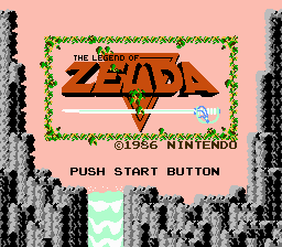
I want to say that the symbol should be something fancy like this screenshot from the original Legend of Zelda.
However, as countless corporations and franchises have demonstrated, symbols and logos get simpler over time. I guess this is because they want them to be easier to draw. The Legend of Zelda has pretty much already gotten to the simplest possible symbol: a plain gold/yellow Triforce. Sometimes you'll see the bird under the Triforce or the Master Sword behind the Hylian shield with the word "Zelda" in a special font, but you'll usually only find them on title screens, official art, and important items. Plain 'ol Triforces are much more common is is becoming increasingly common.
However, as countless corporations and franchises have demonstrated, symbols and logos get simpler over time. I guess this is because they want them to be easier to draw. The Legend of Zelda has pretty much already gotten to the simplest possible symbol: a plain gold/yellow Triforce. Sometimes you'll see the bird under the Triforce or the Master Sword behind the Hylian shield with the word "Zelda" in a special font, but you'll usually only find them on title screens, official art, and important items. Plain 'ol Triforces are much more common is is becoming increasingly common.
- Joined
- Apr 6, 2012
Hylian Crest, definitely. It has the Triforce on it, so it gets in all the points of LoZ, which is what's important...
Braivety
FPT | Breb

i think the triforce and master sword. zelda wouldnt be zelda without them
- Joined
- Dec 30, 2011
- Location
- Canada
Definately the tri-force  :)")
CCG <3 Zelda
CrazyControllerGuy
- Joined
- Apr 4, 2012
- Location
- Hyrule
The Triforce pops in my mind every time I think "Zelda!"
Tadpole
Don Gero's Apprentice
- Joined
- Apr 5, 2012
- Location
- Mountain Village
My vote is for TriForce.
- Joined
- Apr 22, 2012
The Hylian Crest.
Users who are viewing this thread
Total: 2 (members: 0, guests: 2)