• Welcome to ZD Forums! You must create an account and log in to see and participate in the Shoutbox chat on this main index page.

General Art Voting: GCC Week 9 - Halloween Signatures

Who's is better

  • Beeker

    Votes: 0 0.0%
  • Kybyrian

    Votes: 0 0.0%

  • Total voters
    0
  • Poll closed .
Joined
Sep 16, 2009
Location
Cali For Nuh
So week 9 is here for you to two vote, I only received two entries this week, they are both awesome though.

Please vote and leave your critique.

Beeker
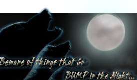
AWOOOOOOO.png


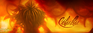
Kybyrian
Cthulhu.png


Voting ends in 4 days! Good Luck to our spooky contestants.
----------------------------------------------


Week 10

TBA.
Check back in Monday or Tuesday for Week 10's theme and medium!
 

Zelda's_Child

~Insert Epicness Here~
Joined
May 15, 2010
Location
Wherever I want to be
Hmm, I'll probably have to go with Beekers, because it seems more Halloween-y to me. It's dark, flowy, and it just all melts together well with the full moon... ;)

I do also Kybyrians siggy, because it fits together well also, but it seems too bright and happy for me for the task... but thats just my opinion.

Well done to both of you!! ^^
 

Kybyrian

Joined
Jan 31, 2008
Location
Amherst, MA
Gender
Didn't I already answer this one?
I do also Kybyrians siggy, because it fits together well also, but it seems too bright and happy for me for the task... but thats just my opinion.

Well done to both of you!! ^^

Using the colors of a pumpkin, in fact. I overlayed the entire image with a motion blur of a jack-o-lantern.

Also, the render is Cthulhu in case you guys didn't know. Cthulhu is a god-like cosmic entity that would cause death if any human perceived his true form. He ravages souls, eats women and children, enslaves human kind and destroys worlds.
 

TheGreen

is climbin' in yo windows
Joined
Jul 12, 2010
Location
San Antonio
First and foremost these are sigs. And so I voted Kybyrian. (as usual:dry:)

It's very well proportioned, and the text adds to the piece. It sort of blends in and enhances the background by giving it focus. The render is brilliant as usual and subtly enhances so as to not take away from the art, but helps it work with the sig.
The background is also quite nice. I prefer mine to be a bit simpler, but you keep to one or two hues and the symmetry of the texturey stuff is set asymmetrically in the sig and gives it a very nice balance.

Beekers is also quite good. The renders look like a copy paste situation, but its rotated and scaled to negate this. If the moon is original then bravo. I always appreciate original graphics. The proportion is a little stocky, but the height is great. I think I would've made it longer and separated the text from the render, not because text should be separate from render, but just because it would fill up the new proportion better. But yes, the text does obscure the ...third coyote? (I can't tell what's behind "that") The font is fine, but the text is a little cheesy for me. I didn't think werewolves/wolves/coyotes went bump, but rather more of a *grrrrrrr**ruwf*
 

Users who are viewing this thread

Top Bottom