• Welcome to ZD Forums! You must create an account and log in to see and participate in the Shoutbox chat on this main index page.

A Link Between Worlds Box Art

What do you think of the box art?

  • Like it!

    Votes: 0 0.0%
  • Don't like it.

    Votes: 0 0.0%
  • In between

    Votes: 0 0.0%

  • Total voters
    0

r2d93

Hero of the Stars
Joined
Nov 10, 2011
Location
Lost Woods
A-Link-Between-Worlds-Box-Art.jpg

So what do you guys think of the newly revealed box art? Personally I love it. It's very majestic and mysterious looking. And of course the gold is stellar
 
Last edited:
Not too shabby. I'm kind of in love with that Master Sword promo-art because it reminds me of the one that A Link to the Past had way back when. Though, I think the logo doesn't fit the overall box design very well. I'm kind of hoping, deep down, that this is just a prototype and the logo will get changed before its release--Like Spirit Tracks and Skyward Sword. Though I have a feeling that since it's only a few more months 'til release, that's not gonna happen. Does anyone here know if it's going to be shiny like the Skyward Sword boxart? Because I think that would be awesome. =]
 

ShadowDiety

Nanomachines, son.
Joined
Apr 12, 2012
Location
Michigan
Definitely one of my favorite Zelda box arts so far. Though, like most others in the series, I prefer the version that isn't all gold.
 

CynicalSquid

Swag Master General
Joined
Aug 1, 2012
Location
The End
Gender
Apache Helicopter
Oh my Reggie.

Mmm qimme dat.

Shut up and take my rupees.

I can't think of anymore lame jokes...

I like it. :)
 
Joined
Feb 23, 2011
I've never really cared about boxart, but I guess it looks neat. I found the logo to be particularly neato...
 

Big Octo

=^)
Joined
Jul 2, 2011
Location
The
It looks pretty good. The focus on the Master Sword as well as the drawing was a nice decision in my eyes, and overall, I'm happy with it.
 

Sydney

The Good Samaritan
Joined
Mar 20, 2012
Location
Canberra, Australia
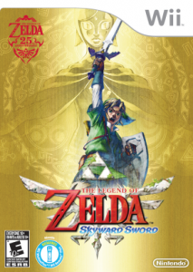
I think it looks pretty interesting, but it's very, very gold. The different shades of gold help make out the surroundings around the Master Sword, but I feel that it could have used at least some more color. What I mean is something more like Skyward Sword's box art cover:
zelda_skyward_sword_boxart-213x300.png

It's not bad by any definition of the word, but it just seems somewhat bland to me. The only reason this would stick out to me on a shelf is because it's gold -- that's it.
 

Ronin

There you are! You monsters!
Forum Volunteer
Joined
Feb 8, 2011
Location
Alrest
Faithful to the premise of this game's story, as far as I can tell. The gold doesn't bother me; I'd have to say that I like it, actually, because the splendor of the Master Sword is frozen in time. The cover has a nice, magical atmosphere to it, which is symbolic of the series' adventuresome, otherworldly spirit. Could they have done away with the gold and integrated a background full of vibrant colors? Certainly. However, the aureate casing contrasts the darkness of the opposite Triforce, thus eliciting a duel of good versus evil, of sorts. They executed that end very well, in my honest opinion.
 
P

pakman

Guest
For what it is, I like it. Would've preferred it not be gold, though. Hopefully they add colours for the European release.
 

snakeoiltanker

Wake Up!
Joined
Nov 13, 2012
Location
Ohio
I'm in between, cuz when i first saw the picture, its wasnt filtered with gold yet, and now that they added the gold....i dont know, just not a sweet looking! Good picture, get rid of the gold!

That would would be my final answer!
 

Salem

SICK
Joined
May 18, 2013
I liked the lost woods background with the Master Sword, it sorta reminds me of the japanese alttp box art, with a random drawing Link on a wall.;)

I wish it wasn't gold.
 

VitaTempusN92

Hero of Time! The True Zelda Genius!
Joined
Feb 9, 2013
Location
Trapped in Darkness :(
Gender
Trans-Female
I liked the lost woods background with the Master Sword, it sorta reminds me of the japanese alttp box art, with a random drawing Link on a wall.;)

I wish it wasn't gold.

What's wrong with it being gold? I actually like that it's gold, it gives the box art a nice effect to it. :)
 

Salem

SICK
Joined
May 18, 2013
What's wrong with it being gold? I actually like that it's gold, it gives the box art a nice effect to it. :)
I would've liked the background better of I can see the trees and stuff in their original colors, that would give a different atmosphere than if it was gold, it would make the box nicer to look at in general.
 

Users who are viewing this thread

Top Bottom