These look nice, but you could use some improvement.
One thing I'd like to critique on your newest works are that the renders, which are usually used as a focus, are tossed to the side of the image and made pretty small, while the text is usually what my eyes focus on. That isn't necessarily good for a signature. You need to make the render you're using the focus, making it bigger so that the face of the character you are using is the first thing one would see is a great way to achieve this.
Another thing is the text, it's best to make the text blend with the rest of the signature instead of making it either plain black or plain white. You can easily do this by grabbing a color from the signature itself and seeing which one best goes with your text. You can also even gradient it with two colors from your signature by making a gradient and clip masking it into the text layer, I believe GIMP can do this. It's also a good idea to put your text close to your focus, so it doesn't distract any or too much attention from what is supposed to be the focus.
Another is the flow, the effects in your newest signatures go the opposite direction as the flow of the renders. This isn't as bad in the first as it is in the second, though.
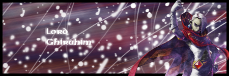
Example:
The movement of Ghirahim's right arm and wrist (from his point of view) makes it so the flow in this signature is not that bad, but the fact that he's so small and can't even take up half the signature goes against this.
The flow in this signature is extremely unbalanced; there is nothing on the background supporting the render, making the signature look like a mess. I suggest you use a smudge tool rather than motion blur, as that gives you more freedom in creating your flow and is overall more convenient and useful.
Cheers.


 ;)")


 but I tried to make it bigger but the pixels messed up