• Welcome to ZD Forums! You must create an account and log in to see and participate in the Shoutbox chat on this main index page.

Zelda Art The Random Drawing Contest Round 23

The Random Drawing Contest Round 23

  • Random Person

    Votes: 0 0.0%
  • De-krumpel

    Votes: 0 0.0%
  • DekuNut

    Votes: 0 0.0%
  • Deniro

    Votes: 0 0.0%

  • Total voters
    0
  • Poll closed .

Random Person

Just Some Random Person
Joined
Feb 6, 2010
Location
Wig-Or-Log
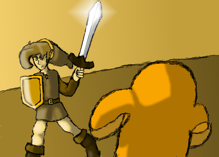
Main Theme : Link's Awakening
Sub Theme : Free For All

Random Person

la_arm_mimic_by_randomperson1310-d3gcfvy.png


De_krumpel

balade_by_rowena_white-d3gnbnz.jpg


DekuNut


Deniro

lagenie.png


Voting ends on 6/14/11.

Round 24 Main Theme : The Legend of Zelda
Sub Theme : The Ninja's of Zelda
(Theme by Mandym287)

Entries are due 6/17/11.
Please remember to read the rules prior to entering, entries must be submitted by personal messaging, do not show any potential voters your entry prior to the contest and that you may send me theme ideas if you would like. Also, from now on if you send me a theme idea, unless you request otherwise I will give you credit if I use your theme. If there are any question, contact me here, VM or PM me.


Xinnamin

Mrs. Austin
Joined
Dec 6, 2009
Location
clustercereal
*puts art critic hat on* Okie, haven't done this in a while, but let's see what we got here...

Random Person: First thing's first- excellent use of monochrome! I approve! Yay for advanced color palettes! Now, I know I'm ALWAYS picking on you about this, but it all goes back to shading. Don't get me wrong, you did the shading wonderfully, you just failed to take into account the second light source you created with the glow on Link's sword (which btw is beautiful). With that kind of a bright glow, the sword would have acted as a secondary light source, which would have made shading considerably more difficult. That being said, it still looks great.

De_krumpel: Impressive coloring you've got there, and lineless too, I'm impressed. I'd say you need to work on anatomy a tad, as the arms look rather stick-like and wonky, and maybe a tad more uniformity in the background (mostly meaning the stone, where the chaotic line placement becomes a bit distracting), but everything else is beautiful. Did you do it all in one layer? Just curious, since I can see the overlap in some of the brush strokes, ie the palm trees.

DekuNut: Always a fan of traditional art, going back to the roots of art and all, so that alone is a plus with me. The quote you added at the bottom is a nice touch too, as is the Egg in the background. I'd say be a tad more careful with the coloring as it goes a little all over the place sometimes, and with traditional, it's always better to try finding a scanner since taking a picture ruins the quality more often than not. Still, wonderful job.

Deniro: Simple and to the point, I like it. The coloring is wonderful too, especially the ball on the hat, though the light source confuses me since the body and the jar thing seem to have conflicting lighting. The grainy texture you used makes for a wonderful effect, though maybe you should have limited it to the jar. Then again I'm not even quite sure what enemy this is having never played LA so ^_^;; At any rate, the simplicity is very charming.

This was a tough call for me as to who to vote for, but I think in the end, RP's entry just barely takes the lead because frankly, I LOVE seeing people play with lesser-used color palettes, and RP used it well.
 

Random Person

Just Some Random Person
Joined
Feb 6, 2010
Location
Wig-Or-Log
De_krumple - I am ridiculously impressed with this. It is lineless which makes me hate/love you because I suck at lineless. I don't really have any problem with this artistic wise except for the anatomy problems that I didn't notice until Xin pointed it out. Also, I don't know who that is but the girl's face is giving me problems. I think the colors you've chosen blend well together and I the shading seems extremely decent to me. My vote is going to you.

DekuNut - Sorry dude, but I haven't played LA and thus I can only judge you picture based on art and not theme. And it takes a lot for me to choose traditional art over digital art.

Deniro - In another contest, I may have voted for this. Its short, sweet and to the point. But I generally look for the creativity and originality in pieces. No complaints about your art though.
 

Random Person

Just Some Random Person
Joined
Feb 6, 2010
Location
Wig-Or-Log
Congratulations to De_Krumple for winning with his entry

balade_by_rowena_white-d3gnbnz.jpg


Your entry will be displayed on Zelda Dungeon, Zelda Dungeon's Deviant Art Account, and the Zelda Art Lovers Group.
Entries for next contest are due 6/17/11.
 

Users who are viewing this thread

Top Bottom