Since Skyward Sword's unveiling at E3 2010, fans have been raving about the game's blend of Wind Waker's and Twilight Princess' visual styles. This was something that I didn't like at first, as I wanted Nintendo to make a Zelda game with more realistic graphics, like Twilight Princess but more refined. The decision to mix the two styles was an intelligent move on Nintendo's part - it appeals to fans of WW and TP. Not to mention that these two Zelda games have been regarded as the prettiest in the series' history, it is only common sense to take the best from both worlds.
What drove Nintendo to do such a thing could also be because Wind Waker and Twilight Princess both fell short in their visuals undertakings. The Wind Waker has a distinctive cel-shaded appearance that draws in a broader audience than previous Zelda games. The graphics seemed to be torn right out of a cartoon, but wasn't cutesy to the point where the game would not appeal to adults. WW doesn't struggle to make characters look decent, as everything falls naturally into place with cel-shading. However, while the graphics are palatable, they are often criticized, making WW one of the most polarizing Zelda titles ever. TP, on the other hand, takes a darker approach. Realism was the goal, and Nintendo almost achieved it. While the game ran very smoothly and used bloom lighting to full effect, most characters were a pain to look at and aren't rounded well. Environments are breath-taking when seen from afar, but textures and models look a mess when seen up close.
Skyward Sword's combination of the two rids the game of any visual blemishes. Take Link for example.
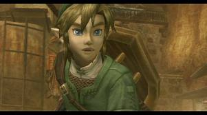
Twilight Princess Link (above) is rather detailed, isn't he? You can definitely notice rough edges that aren't supposed to be there. The use of shadows and other more sophisticated effects is the graphics' downfall. Sometimes things don't look quite right an fail to capture the realistic tone that Nintendo intended. Skyward Sword is also noticeably patchy around the edges, but they don't look ugly because the style is half cel-shaded.
Skyward Sword Link (above) isn't that detailed, but sometimes simplicity is bliss. Wind Waker's graphics were deemed too simplistic and child-like by some, while Twilight Princess is beautiful as a whole, but is ugly up close and looks unattractive in some areas. SS swoops in and finds a happy medium between WW and TP. The in-game characters and environments aren't too detailed, so that leaves less room for error. But the graphics are in no way childish. The end result is a game with a silky smooth style that perfectly hones the Wii's limited graphical powers and uses the resources it has wonderfully.
I'm excited that Nintendo was able to make Skyward Sword look so magnificent despite the Wii's limitations. SS' impressionistic, watercolor design is effective and artful. The game certainly has some of the best graphics on Wii.