1. Destiny
Destiny always delivers beautiful if somewhat predictable artwork. Here she has chosen her favorite subject of the month, Loki, Norse God of Chaos. She starts with a highly detailed, well-chosen side view with the neck turned towards the viewer. This both saves space and reveals more information about the back and arm than your standard frontal shot. She has brought in a yellowed old paper texture that has been a trademark of her work for a while, and it works very well with this subject, given his association with legends and the color of his armor.
She also adds a natural looking lighting effect over his cape and arm that almost look like they were part of the picture to begin with. Only a few faint artifacts betray that the overlay is not natural. They help blend him into the scene and highlight the details of his armor design, without obscuring it in any way.
Also, we see her blend several fonts together in a vertical pattern. "In the end, you will always kneel." This phrase on its own pulls together a remarkable image of how Loki looks at power and respect, and his childhood experiences. The myriad fonts used seem to reflect the disjoined, conflicting nature of his own mind. How he's driven by one part of himself to be this way, and another part to be that way. This results in his behavior being sometimes good, sometimes evil, but always unpredictable. A God of Chaos, indeed.
If anyone understands the value of creativity and innovation, it's Destiny. But through her artwork, she shows us time and again her unspoken philosophy. That the classical ways of doing things, the tried and true methods, actually produce the best results.
9.5/10
2. Mandy
Mandy has been one of my favorite signature artists on ZD for a long time, even back before it was called DGE. She always manages to surprise me with an interesting design or a unique effect, but she sometimes seems prevented from expanding her horizons and fleshing things out by her older machine.
Mandy has chosen a very cute picture of what appears to be a demonic bat of some sort from Hamtaro. The mild blur around it gives it a mystical aura, and adds to the mysterious feeling I get from this character due to not knowing their identity.
I love the randomly faded blue squares on the left side of this image. They evoke thoughts of geometry, file cabinets, security systems, and so many wonderfully ordered, organized systems in an abstract way. You can sense that Mandy has a strong awareness of the beauty in the underlying order of things just from this.
The right side of the image is even more interesting, as the pattern suddenly stops and you just see the dust from the broken letter B descending into the abyss, as if there were some kind of void in her soul caused by the very heartbreak she describes.
Naturally, the contrast between fonts is interesting and meaningful as you would expect from Mandy, and highlights a dimension that's clear from the rest of the image. The left side, with its simple, bold, sans-serif font, seems quite orderly and simple, with a methodical concept behind it. The right side seems to have disruptions within the order itself that give rise to creative thought. Two fonts are used on the same word, with different shades and parts of them breaking down in analysis. It evokes thoughts of the left brain/right brain dichotomy that's present in all of us, and Mandy has illustrated the feelings that can come about when those two are in discommunication.
The only flaws in this piece are that it is a bit too small, and the central character takes up a large portion of the image. This does not leave enough room for the ideas expressed on either side to be fleshed out to their fullest potential. This work is excellent and has a beautiful foundation, but it feels like it could have been taken further.
8/10
3. Rachel
I don't know Rachel at all, but I really like her entry. Scar is one of my favorite Disney villains, and one of the first strong impressions I remember from my own childhood. Anyway, when depicting Scar with the appropriate emotional tone, your goal is to create an angry, chaotic, bloody feeling. Rachel has achieved this. I can tell that she is thinking outside the box here. The edges of the image itself are frayed and jagged at random, as if it had been torn from a larger sheet of paper.
The broad, black brush strokes at the top create a smoky feeling, while the thinner fabric woven of red lines near the bottom evokes fire without actually drawing it. The scratchy font in red definitely evokes the anger and cruelty of which Scar is capable, even evoking the word and cause of a scar itself.
However, there are things which detract from the enjoyment of this image. Many of the effects used obscure much of the underlying detail in the picture, making it more difficult to appreciate the original art of the Disney animators. The words in the picture should have been in a darker shade of red, perhaps maroon, both to help them stand out from the background, and to evoke the idea of a dried scar rather than a fresh wound.
But overall, this picture captures perfectly my emotional state when I watched the Lion King at age 7, and helps me recapture that impression of how Scar felt so menacing and cold at the time.
7/10
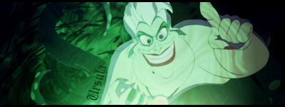
4. Beeker
The use of green creates a gloomy, sickly atmosphere appropriate to the piece. The font used on Ursula's name also contributes to the old, haunted atmosphere. However, the font is a bit small, and the background is a bit too dark to make out details against it.
6/10
5. Markasscop
I feel like a LOT of effort went into this, but I'm not quite sure it worked out the way he wanted it to. The solid purple background is somewhat simplistic and jarring, but let's leave that alone for a moment and look at what's actually there.
Porky or Pokey Minch, is a villain from the Earthbound series. As such, he resembles a childish version of a mad scientist.
In the center is a nice, 3D image of Master Pokey himself, which is an excellent placement choice. It has a strange red glow which seems a little out of place, but it does fit with the neon theme which this image seems to be going for.
There was an attempt to contrast with the centerpiece in an interesting manner via giving the text a blue glow with red in the middle (which is opposite from the red glow with blue in the middle in the main image), but it doesn't work because everything in the image competes for your attention and contrasts with everything else.
I like the way that there's a small 2D sprite of Pokey right above his name, it's a nice little touch.
All of these images of Pokey in the background would be nice little touches on their own, actually. But when put together like this, it makes the image seem far too busy and jarring. You can't decide what to focus on. All of the images themselves are rather high quality in my opinion, however, and I would be interested in seeing what comes from Mark in the future.
5/10
6. Illusore
The fractal-based background image here is nice and has a lot of potential. The fonts used and the word Ghirahim are well-presented and the color matches his own. However, that is unfortunately where my praise stops and my criticism begins.
First, Ghirahim is not blended into the background well at all, nor can he be. The contrast is simply too great. Also, there is a lot of unused empty space in the image that could have been filled by a quote or something. Also, with this much unused canvas, it feels like it might have worked better with Ghirahim in the center rather than the text. You are left with the feeling that something important is missing from this work.
4/10
7. Chilo Freeze
This image is rather entertaining for some reason. It's just fun. While it's not a masterpiece by any means, it does manage to convey an idea. The random, blurry purple shapes in the background make me think of an old comedy or talk show from the 1970s or 60s, around the time the original Batman came out. It also more accurately captures that neon effect I think Mark was going for.
The Joker's name here is presented in a clearly neon-friendly white font, also making me think of a comedy set.
The mental image I get is of the Joker being a failed comedian who went insane because no one watched his show or liked his jokes. While this is completely inaccurate and has nothing to do with Batman, I feel like the idea of it is somewhat entertaining.
But overall, the image itself seems like the character was just pasted in over a background, and some nice text was added. It gets credit for being funny, however.
3/10
8. Raindrop14
There really isn't much to say here. All I see is that someone took an average image of a Twilight Creature, applied a broken glass effect to it in some program like GIMP or Photoshop, and called it a day. No text, no underlying idea, nothing. I don't really think that deserves any credit at all.
0/10


 Chilfo, Mandy, Destiny, Markasscop, I really liked yours but at day's end...Illusore and that sexy


 ,CURSE YOU INTERNET FOR NOT PROVIDING ME W/ A BETTER CLAY PORKY MODEL IMAGE [yeah,i SHOULD have used the pig king statue]