• Welcome to ZD Forums! You must create an account and log in to see and participate in the Shoutbox chat on this main index page.

GCC SBB Theme Voting Round

GCC Voting round SBB Theme

  • Pancake Samurai

    Votes: 0 0.0%
  • Atticus

    Votes: 0 0.0%
  • Terminus

    Votes: 0 0.0%
  • FirevsIce

    Votes: 0 0.0%
  • Krazy4Krash

    Votes: 0 0.0%

  • Total voters
    0
  • Poll closed .
Status
Not open for further replies.

Vanessa28

Angel of Darkness
Staff member
ZD Legend
Administrator
Joined
Jan 31, 2010
Location
Yahtzee, Supernatural
Gender
Angel of Darkness
Okay! I received a couple of entries and the voting is about to begin! Soooooo.... first of all thanks to everybody who participated. And don't worry if you're not winning. Participate is more important than winning because we all can see how talented you are ;) That being said let's start! Good luck everybody.


Entry 1 by Pancake:

8yghK.png


Entry 2 by Atticus:
fox_by_turbo_chan-d7h58mh.png


Entry 3 by Terminus:
5yh7Iz4.png


Entry 4 by FirevsIce:
kirby_signature___fighter_kirby_by_firevsiceultimate-d7g8spl.png


Entry 5 by Krazy4Krash:
vpbvki.jpg
 

Sydney

The Good Samaritan
Joined
Mar 20, 2012
Location
Canberra, Australia
GOSH VANESSA I WAITED ALL DAY (loljk ilu)

Cakepan:dat pink bg tho

Term: swag idea, not bad at all

FvI: really cool, i like what you did

Krazy: super bash sis -- all of my yes

gonna have to go with FvI on this, tho it's a pretty close call (like, really close)
 

Mellow Ezlo

Spoony Bard
Joined
Dec 2, 2012
Location
eh?
Gender
Slothkin
Wow, some amazing entries were submitted in this round!

It was a tough choice, but my vote ultimately went to FirevsIce. You did a phenomenal job blending the background with the render, it's just amazing. Great job!

Also, K4K, Super Bash Sis... I love you. XD
 

~Mizuki~

ALWAYS LEAVE BOX 5 OPEN
Joined
May 9, 2010
Location
...Asgard
Gender
androgynous
My vote goes to Atty. I just love how each C4D was placed, it really gives the graphic some flow~
 

Firice da Vinci

Distinct lack of Leonardo
Joined
Jun 15, 2010
Location
Renaissance Italy
#OMGenus
#CritiqueTime

With yours, PancakeSamarai, I believe you are on a splendid path with C4Ds. The background is not drowned in color and a mild sense of depth is established. I spot a hint of depth here and there. I must say,though, that the canvas size and SSB logo are much too large, causing poor Princess Peach to shrink. It would be ideal to place the focus on the render. An easy way to do this is with cropping. In MS Paint, I cropped it down to a more suitable size. I hope you don't mind.
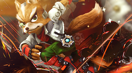
Have to go with Atticus on this one. You did a really nice job with depth, lighting, and effects. As Erebea brought up, there is strong "story-telling" with the illusion of dust, sparks, and the afterimage of Fox, reminiscent of said character's Side-Special. The text has also been placed in a pleasing, inconspicuous manner. My only complaint is that the color range is a little too large. I think there needs to be more emphasis on the red to blend the oranges and browns. That should make the complementary green on Foxes pants and eyes really pop and the cyan on his, umm, doohickey to stand out. Maybe a gradient map with a dark/desaturated red-light/saturated grean on saome layer effect would help? Other than that, I have no qualms.

The concept is pretty cool, Terminus, but I can't say much else about it. You managed to form a symmetrical composition, which can be fairly tricky, even digitally.

Super Bash Sis? Yes, Krash4Krash. So much yes. On a more critical note, there isn't really anything going for it other than SBS. I would like to say that it was nice how you made the three girls look in the general direction of the logo, which incorporates a sense of direction.
 

Vanessa28

Angel of Darkness
Staff member
ZD Legend
Administrator
Joined
Jan 31, 2010
Location
Yahtzee, Supernatural
Gender
Angel of Darkness
I think all of the entries are pretty cool. I give you all one advice. Shadow. Try to add the shadow on some sides you think that should have some;) This gives it a more realistic look and will add more depth to the work. But besides that I'll say great job :yes:
 

CynicalSquid

Swag Master General
Joined
Aug 1, 2012
Location
The End
Gender
Apache Helicopter
My vote goes to FvI

It's the most creative and well designed out of all of them, in my opinion. Term's was a very close second though.
 

Krazy4Krash

Moderator
Staff member
Moderator
Joined
Jun 15, 2010
Location
'straya
PancakeSamurai - Quite slick and good looking. I would have criticised it for being too plain if it weren't for the cool background, really well done.

Atticus - Very fine. Fox's colour works outstandingly well with the background and it's intricate in just the right sense.

Terminus - While usually I'm not a fan of instances where there are duplicated contents inside an image, I like the feel of this one regardless, especially Link and the Smash Balls. Shadows and glows done excellently.

FirevsIce - Kirby fits in nicely, and the transparency is great. I really like the border, as well.

Krazy4Krash - While you've put in some very sexy character renders, you seem to have been too abstracted to build on your concept.

My vote goes to Atticus.
 

Fig

The Altruist
Joined
Jul 23, 2011
Location
Mishima Tower
All of these designs are beautiful and I want tot congratulate each participant an excellent job well done for creating interesting graphics. As much as I want to vote for everyone, I had to give my vote to Atty. While I don't know the terminology when it comes to graphic design, but the textures and layout of Att's graphic is beyond extraordinary. I hope everyone had an amazing time creating their graphics for the return of the GCC! Can't wait to see you guys compete in the next graphic competition! :pikalove:
 
Status
Not open for further replies.

Users who are viewing this thread

Top Bottom