• Welcome to ZD Forums! You must create an account and log in to see and participate in the Shoutbox chat on this main index page.

Best-Looking Console

Hyrulian Hero

Zelda Informer Codger
Joined
Oct 6, 2016
Location
SoDak
Now there's a loaded answer. I've never owned a Slim PS3 but the Super slim was butt-ugly. I own two of the old fatties though, now that was a beautiful console. The piano black with silver lettering, glossy all over...it's not my personal preference for a game console but it's a beautiful piece of tech in general. And there was the ceramic white console as well...maybe even better-looking.

mhtpnz0pqo271.jpg

I distinctly remember when the Nintendo Revolution was announced and I was immediately dead-set on getting the lime green one. Every other color was released. *single tear*
 
Joined
Jan 10, 2022
Gender
Male
GameCube is good, wish I could have got a silver one. But I think my favorite overall was the Wii with just how simplistic and sleek it was with the angled stand and the blue light. As far as handhelds go, I like how shiny the GBA SP and the original DSs are.

That all said, the Vectrex did look pretty interesting. One day I might like to get one just for the novelty of it but it’s likely price will only rise.
 

Hyrulian Hero

Zelda Informer Codger
Joined
Oct 6, 2016
Location
SoDak
GameCube is good, wish I could have got a silver one. But I think my favorite overall was the Wii with just how simplistic and sleek it was with the angled stand and the blue light. As far as handhelds go, I like how shiny the GBA SP and the original DSs are.

That all said, the Vectrex did look pretty interesting. One day I might like to get one just for the novelty of it but it’s likely price will only rise.
I've always said I want a Vectrex for the innovation!

Also, I was a really big fan of the DS Lite, I still think it's the best-looking of any of the DS line except maaaybe the DS-i but I need GBA comparability.
 

Jimmu

Administrator
Staff member
Administrator
1577430e-3038-4cbf-a545-6bf8cbfb165e_1.4221efd3f903a904753156e2441d66ef.jpeg

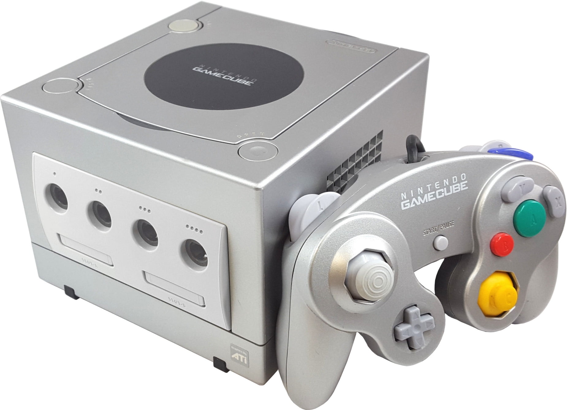
Compact, unique, and stylish, GameCube really nailed being both something easily recognizable while keeping an inoffensive appearance and taking up little space.

It's just a super simple design, but one that you really can't forget. I think that's the basis for any good console design. Nothing over the top, but something that is memorable. Platinum best color.
Not only all that but also a handle? Genius :P
For me personally I love the curved and friendly looking design of the PAL SNES (not so much the US version with the boxy design). Much of this is probably bias due to nostalgia but I love it nonetheless.
 

Requiem Of Spirit

It's a secret to everybody...
Joined
Feb 16, 2021
Location
Hyrule
As others have said before, I think the Gamecube was one of the better looking consoles. (If not the best looking console.)
GameCube-Console-Set.png

The design was original and appealing, and the colors were nice too, not too bright or too dark. I really like the purple one.


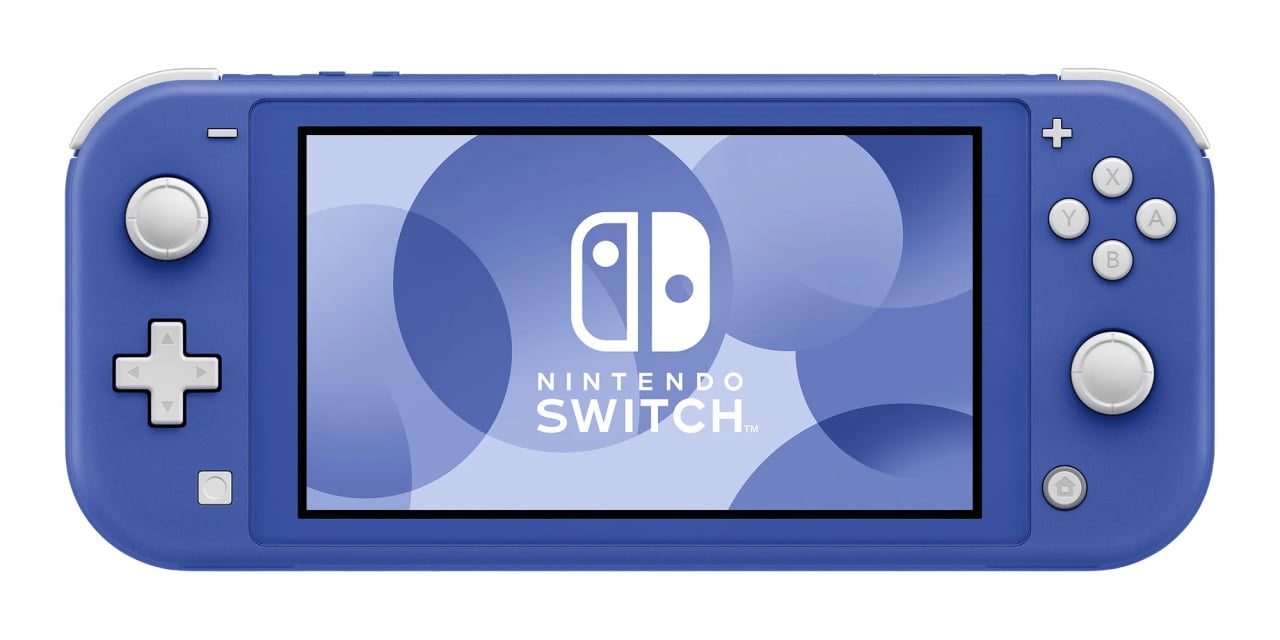
If handheld consoles count, I also think that the Gameboy advance and the Switch lite look pretty good. :)
101fa0f25469d73dbc8471eab8856f3f.jpg

the-switch-lite-in-blue-or-purple.large.jpg
 
Last edited:

thePlinko

What’s the character limit on this? Aksnfiskwjfjsk
ZD Legend
I gotta say, despite being one of the worst selling consoles Nintendo has ever produced, the Gameboy Micro is one sleek little system.

BFC195B6-EFCF-40E2-8FBC-310CDDC0D93B.jpeg

Honestly I think it’s on par with the original GBA in terms of looks, if not even better. There was also a Famicom color scheme that looks beautiful.

239257D3-3168-4DF9-9A3E-D9B983E05BCB.jpeg

You could also change out the face plates, with my personal favorite being the Cup Noodles one

DB9305FC-1C38-4F93-8DA6-86B63A91B9EE.jpeg
 
Last edited:

Hyrulian Hero

Zelda Informer Codger
Joined
Oct 6, 2016
Location
SoDak
images (7).jpeg
I don't care for the leds but at least it's not an entirely boring design. What design improvements could the Colonel make on this? I'm wondering if a view-window for the fried morsels would behoove the end-user.
 

Users who are viewing this thread

Top Bottom