• Welcome to ZD Forums! You must create an account and log in to see and participate in the Shoutbox chat on this main index page.

General Art Voting: GCC Week 8 - Movie Signatures

Who's is better

  • Kybyrian

    Votes: 0 0.0%
  • TheGreen

    Votes: 0 0.0%
  • Beeker

    Votes: 0 0.0%
  • Joise

    Votes: 0 0.0%
  • Baysiderulez

    Votes: 0 0.0%
  • Random Person

    Votes: 0 0.0%

  • Total voters
    0
  • Poll closed .
Joined
Sep 16, 2009
Location
Cali For Nuh
Sorry guys I've had quite the busy weekend, but the time is here to VOTE! This week's theme was Movies. You know the drill... Comments and Critiques are always appreciated.

Voting Ends in 4 days, so lets get started.

Kybyrian
IpMan.png


TheGreen
MovieSig-1.png


Beeker
LetsgotothemoooviesXD.png


Josie
x4prsw.png


Baysiderulez
gcc_8_movies.png


Random Person
whatwouldyouwishfor.jpg


--------------------------------
.
WEEK 9

Theme: Halloween
Medium: Signatures

Due: Saturday October 23, 2009 @11:59PM PST
(-8:00GMT)

PM your completed entries to me! Good Luck
----------------------------------

Sorry Guys I screwed up, poll had to be started over because I missed an entry. Hope that doesnt deter you from giving everyone a fair chance... that was a jo fail.
 

February Eve

ZD District Attorney
Joined
Mar 21, 2010
Location
USA
I ended up voting for Jo's because I like the way it was constructed, with the overlay popping out (*does not know technical terms*). It also seemed to use its space well, and I liked the size as to me - to me, it was slightly atypical and helped it stand out.

Random Person's was a close runner up. I'm not sure if you added in the people in the gleam of the magic lamp or if it was in the original image, but it made the sig for me. The text was also nice.

As a side note, it's fun to watch you and Josie improve with each new signature. :)
 

Random Person

Just Some Random Person
Joined
Feb 6, 2010
Location
Wig-Or-Log
Random Person's was a close runner up. I'm not sure if you added in the people in the gleam of the magic lamp or if it was in the original image, but it made the sig for me. The text was also nice.

The original pic was the exact screen shot from the movie of Aladdin holding the lamp. I'm not sure if Bay allows posting original pics, so I won't just yet.
 

TheGreen

is climbin' in yo windows
Joined
Jul 12, 2010
Location
San Antonio
I'm a bit confused about the voting.

Beeker's is winning and I think it's well done, but it looks like clip art and like everything was just sort of placed in there (plz correct me if I'm wrong)

I like Kybyrian's quite a bit. The whole vignette thing is working well and it's had good success in the past competitions. I also like that the text has a little texture to it.

I like Random Person's but something about the colors are throwing me off. I don't get why Aladdin's hands are purple :/, but the effects are all nicely done.

Mine is from district 9 if you hadn't figured that out. I drew the Prawn (the alien) in Adobe Illustrator. I traced an alien from a screen shot then added the facial expression and clothing so that it matched Christopher Johnson (a character from the movie). The rendered the ship in the background and Sharlto Copely as well. Gave things an orange/teal tint to look "hollywud" and texture on the background is custom whateva.

I voted for Baysiderulez, tho. The render is nice and the whole sig is clean. I think the secondary render could have been a little less translucent, but it's still legible so it's all good :)
I'm also have fond memories of The Land Before Time :lol:
 
Joined
Sep 16, 2009
Location
Cali For Nuh
And now for my Critique

Kybyrian
Very nicely done, its sharp and beautiful. As for a suggestion. I think the text is a little awkward and detracts a bit from your render. Your render should almost always be the main focus on your signatures. At least it should always be more emphasized then text. But overall good job.

The Green
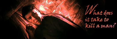
Alright, I've been thinking about my critique on yours all day, especially since last week you said you wanted tips on how to make a signature. 3 Things pretty much all successful signatures have... unobtrusive text, a border, and a render. You have 1.5 of the 3. Your render is awesome, I love the fact that you did it yourself in illustrator and that definitely won you some brownie points in my book. Your text. Its far too large in my opinion, and I stick with the same advice I gave Kyky... Your render should always be more emphasized then your text, and it should not detract from the render (or in this case your overall signature). What bothers me also about the text is the fact that your render is covering part of it. Lastly, I think if you had added a border this signature would be much more complete... I think "widescreen" bars would have fit perfectly in this movie context. View this sig for an example if you want to know what I mean. Lastly I believe you said you took some graphics classes, and as I have not I cannot really say... But I think signature making probably breaks all the rules that they may (or may not) have given you. As a final tip... and this is just an idea, pick 2 or 3 colors to create your signature out of, you can use more, but its sometimes helpful to use colors out of your render (I did this in my sig, and I do it in most of mine). [example] all the colors are pulled out of the render... I hope this helps. Again to highlight the fact... I absolutely love that you created your own render. And for that I am giving you my vote this time around (I am an extreme sucker for those type of things)

Beeker
Nice signature... Not to complex, yet not too simple. My only complaint is once again text... I think you could have done something a little bit more creative with your text. it looks like it was just slapped on top and given a gradient effect. Text should become apart of the art and not look like it was added very last minutey.

Josie
Hey girl, your cut outs look way better this week then on your ones from last week. My advice for you is, to pick fewer renders... Less is more. Had you kept that spiderman background, and brushed around it. or made it slightly transparent with a brushed background behind it, It would have been amazingly sharp looking. Try to stick with only 1 or 2 renders per signature, it will go a long way into making your sigs look more professional and less crowded. Also you are missing your text. generally signatures do have some text somewhere to signify that the sig was made specifically for you or says something symbolic to the signature. No text though is better then ill placed text in my opinion so its not really a bad thing.

Random Person
I'm not really sure what you meant by that comment about original pictures.... Had you just sent me a screenshot I'm not really sure that would be acceptable as an entry for a signature contest as you didn't really do anything. I feel like your text had perfect placement here and didnt detract away from the "Lamp". I do feel however that something original could have been done to make this sig a little more then a screen shot with text. Perhaps lighting effects, brushing, or something really anything to manipulate the image and give it your own little pizazz would make it more interesting to look at. But good job. I think you've nailed using text effectively. It almost blends in with the stars yet is visible enough that you can actually read it.

Good work this week guys. I hope you find the critiques helpful =)

And yup, yup, yup I picked Ducky. She rocks my socks.
 

Beeker

Wild Card
Joined
Jun 14, 2010
Location
Canadia
Thanks for the critiques, it's quite useful to see what is needed to be improved!^^

I like Jo's the best. The render takes most of the space and the text, while a little small, works well, short and sweet.

Nice job on the sigs guys! =D
 

Random Person

Just Some Random Person
Joined
Feb 6, 2010
Location
Wig-Or-Log
Random Person
I'm not really sure what you meant by that comment about original pictures.... Had you just sent me a screenshot I'm not really sure that would be acceptable as an entry for a signature contest as you didn't really do anything. I feel like your text had perfect placement here and didnt detract away from the "Lamp". I do feel however that something original could have been done to make this sig a little more then a screen shot with text. Perhaps lighting effects, brushing, or something really anything to manipulate the image and give it your own little pizazz would make it more interesting to look at. But good job. I think you've nailed using text effectively. It almost blends in with the stars yet is visible enough that you can actually read it.

Pardon me, but I've done more than just add words to a simple screen shot. I guess since I've seen this movie a million times, I know it by heart and can tell easily that the scene has been manipulated.
 
Last edited:

athenian200

Circumspect
Joined
Jan 31, 2010
Location
a place of settlement, activity, or residence.
I like Random Person's picture the best.

It seems very clear, doesn't have a lot of hazy effects, and has very crisp outlines. It doesn't look drawn. I love the starry background, and I enjoy the symbolism of the magic lamp in relation to movies. It helps you see the creative, fantasy side of what goes into movie making.

I'm pretty sure the image isn't a screenshot. I think he took the lamp from a screenshot, but then added another background. I'm not sure if he added the people in the foreground or not.

EDIT: He did! Yes, it's very good. I think it actually looks better than the original.
 

~Mizuki~

ALWAYS LEAVE BOX 5 OPEN
Joined
May 9, 2010
Location
...Asgard
Gender
androgynous
Baysiderulez;194833 [B said:
Josie[/B]
Hey girl, your cut outs look way better this week then on your ones from last week. My advice for you is, to pick fewer renders... Less is more. Had you kept that spiderman background, and brushed around it. or made it slightly transparent with a brushed background behind it, It would have been amazingly sharp looking. Try to stick with only 1 or 2 renders per signature, it will go a long way into making your sigs look more professional and less crowded. Also you are missing your text. generally signatures do have some text somewhere to signify that the sig was made specifically for you or says something symbolic to the signature. No text though is better then ill placed text in my opinion so its not really a bad thing.
Well I did I first start with the Sized and work my way through and the pictures I use were spiderman 3 and the back I have to start over with that background when I tried with brushes but it didn't work with me so I used a Spiderman one and about the text I could not think of one if I had what I was about to say in it was too late because I just thought of after I gave it to you and I kinda had to cute out some more of one of them it took my 2 hours to make it
 
Joined
Sep 16, 2009
Location
Cali For Nuh
Yeah, did you understand my post though? About making one with fewer pictures in it? I liked your background I really do, I think you could have done something around the main image of the spider to make it more of your own. But overall it looks good. There is great improvement between this signature and the wallpaper you sent me last week. Which is the goal of these competitions in the long run.

I want to encourage you to keep working hard, while giving you suggestions on ideas that you might try so that you can become even better. Critique is part of the art business.
 

~Mizuki~

ALWAYS LEAVE BOX 5 OPEN
Joined
May 9, 2010
Location
...Asgard
Gender
androgynous
Okay well this I'd Had to look at it if it works but it did not work out so I started over and understand what you said to improve them
 

Users who are viewing this thread

Top Bottom