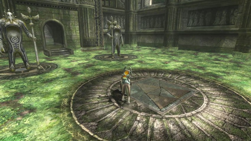
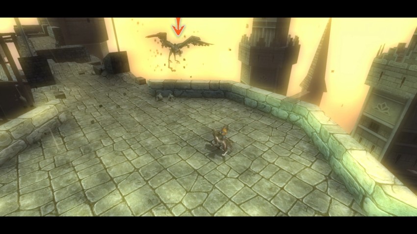
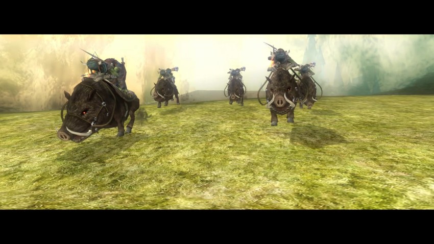
Twilight Princess HD Boxart and Screenshots
Posted on November 14 2015 by Alexis S. Anderson
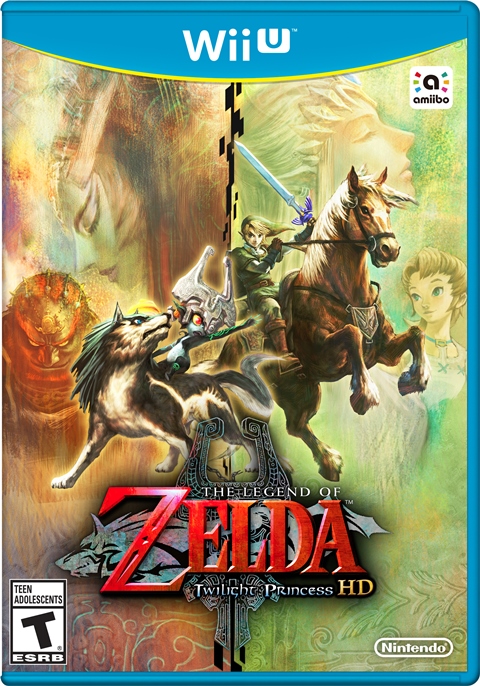
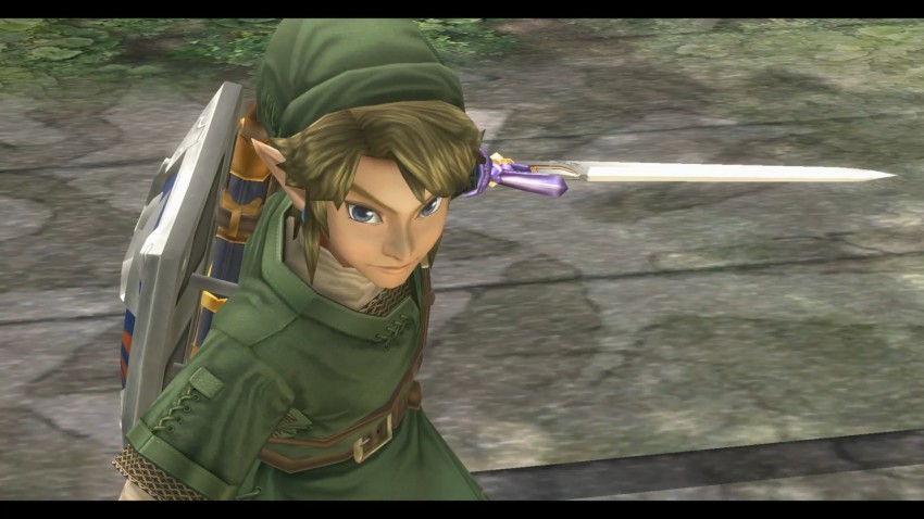
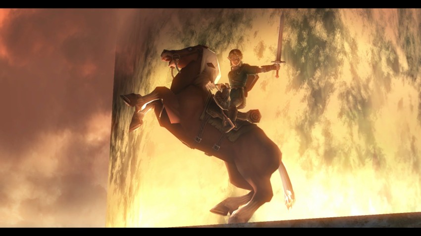
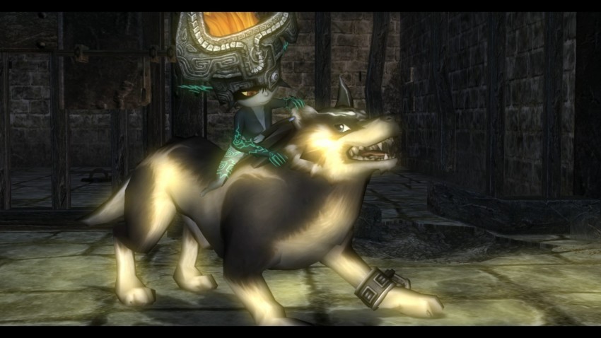
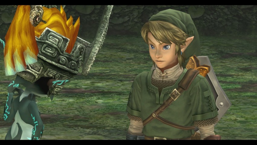
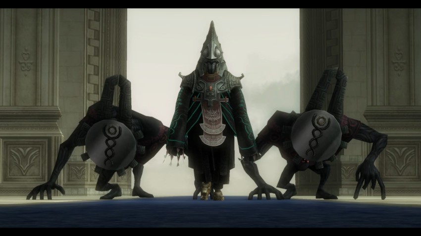
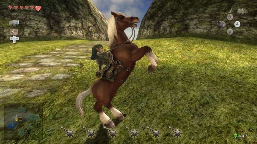
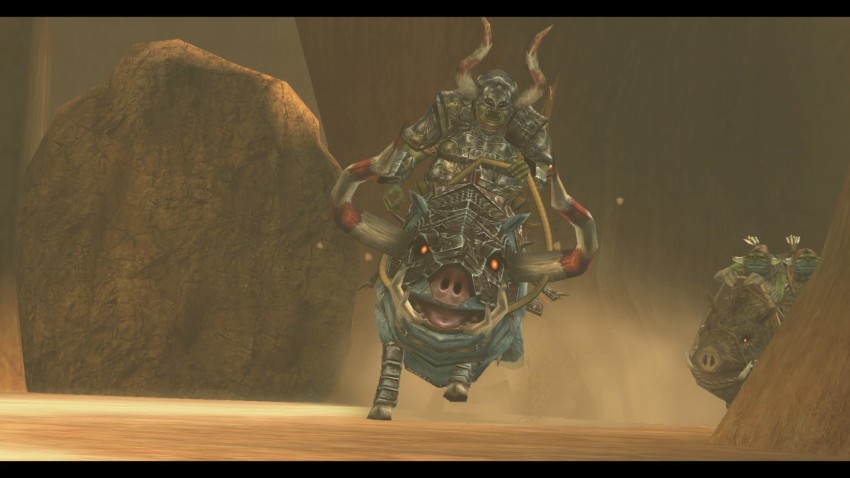
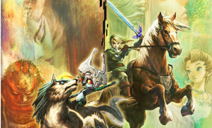 No doubt many of us are excited for March 4th– the day when we’ll be able to hold in our hands the coveted Twilight Princess HD for the very first time. But as with any HD remake, some things have changed, one such thing being the game’s boxart. Instead of the traditional Wolf Link and Link split side view, we’ve got a couple more of our beloved characters donning the cover. True to the HD label as well, the game has received a visual upgrade and we’ve got the screenshots to prove it. See the new boxart and screencaps after the jump!
Here’s the box art, now featuring Epona, Zelda, Ilia, Ganondorf, and both imp and trueform Midna:
And here are some screenshots of the new HD visuals:
I personally love the new cover, if only because trueform Midna looks divine on it; the original cover is iconic in my mind so while I do miss it, I’ll admit this design is a worthy rival to it. In terms of the HD, I don’t see that drastic of a difference. Everything is smoother and details are clearer, that much I can see, but it’s hard to make any startling improvement to the most realistic looking Zelda game to date. Either way, I’m looking forward to playing the life out of this remaster.
What do you guys think of the new cover? How about the visual changes? Do you think enough has changed to warrant purchase of the HD version, or are you content just playing the Wii game? Speak your mind in the comments!
Source: Nintendo Everything
Alexis S. Anderson is a Senior Editor at Zelda Dungeon who joined the writing team in November, 2014. She has a JD from the UCLA School of Law and is pursuing a career in Entertainment and Intellectual Property Law. She grew up in the New Jersey suburbs with her parents, twin brother, and family shih-tzu.


