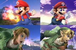
Super Smash Bros. Wii U vs. Brawl comparison screenshots
Posted on June 23 2013 by LukeSaturn
 With the new Super Smash Bros. game revealed, many discussions have erupted. And the discussions range from the character roster and its new characters to the graphics of the game, the graphics being somewhat controversial as with most other aspects of the game. Some argue there isn’t much of a difference while others praise the Wii U’s engine. But controversies will arise no matter what. However, a user of the site NeoGAF by the name of Silent_Ocarina has pieced together a handy little photo set of screenshot comparisons between Super Smash Bros. Brawl and the new Wii U Super Smash Bros. He noted that there are many re-used poses and shots of characters between the two games in the promo images.
I was already pretty excited about the new graphics, especially with Link, but these display a better comparison than just my memory. As GenGAME pointed out, I can see tons of animation improvements. I especially am impressed with the stages and their backgrounds. Some characters I find to be much clearer such as Link (of course), and some characters are just much more refined and smoother looking such as Kirby and Samus. Some characters I could go either way on such as Mario, Bowser, and Pit. The new designs of these fighters seem to be less detailed than before in my opinion, but overall it fits the style of the game and everyone/everything is much more colorful and refined in this game.
I, however, do not just want to post all the pictures here for you to view. The original page deserves the credit. You may find the original NeoGAF thread here.
If you miss it or can’t find it, here are the photo sets on GenGAME.


