Majora’s Mask: Comparing Remake Vs. Original
Posted on November 06 2014 by Tyler Tag
Now that Sotoru Iwata has given fans a glimpse at the 2015 remake of Majora’s Mask, there are so many images and scenes that need to be compared back to the original release. Thankfully YouTuber, ninten2tv, has created a handy comparison video for us to analyze. Hit the jump to view the video and see for yourself.
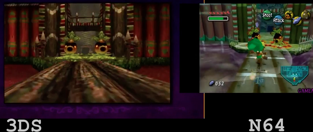
The video on a computer can only do the textures, design styles, and colors so much justice. I think the game will appear much more developed when fans receive the finished product.
While the 3DS has the capacity to almost handle Twilight Princess-esque graphics, I like how the designers have chosen to tweak and refine the original design style. While some textures still look a little rough, a lot has been upgraded and polished. On the contrary, the video shows that some aspects of the game have been left in their original states. I think this balance of upgrading and keeping the original feel of the game is an improvement from the remake of Ocarina of Time 3D, when the entirety of the game seemed brightened and changed.
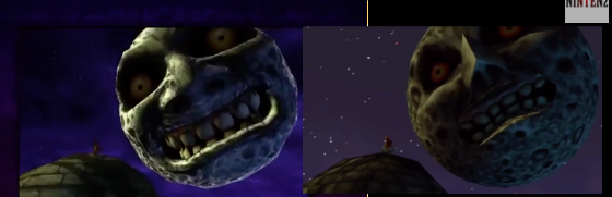
Some small details I noticed from the video include Majora’s Mask and the Moon. The new moon looks just like the one in Hyrule Warriors. The facial features, while they appear more defined and rounded, look enlarged from the original design. The same can be said for Majora’s Mask. The eyes of the mask take up more mask space on the 3DS platform than the original N64 one.

What other details have you noticed when you look over the comparison video? Are you excited about the remake? Do you think the developers are on the right track or are they messing with the original atmosphere of the game? Type your comments below!
