How our First Look at Zelda Wii U Compares to Recent Zelda Reveals
Posted on June 25 2014 by Parker
 The announcement of a new Zelda game holds the potential to shock, surprise, underwhelm and alienate -sometimes all at once. Earlier this month, Nintendo’s E3 event injected the Zelda fandom with a healthy dose of excitement. Alongside a flood of new Hyrule Warriors details and gameplay footage, the Japanese gaming company finally revealed the newest main installment in the venerable fantasy franchise.
Now, with the dust kicked up by E3 finally settled, we can fairly judge whether Zelda Wii U succeeded at wowing gamers with its debut appearance. First impressions matter. How the game presented itself last week will shape speculation on Zelda forums for months to come. To determine its effectiveness, we need to look back on the unveiling of past console Zelda games for comparison. How does our first look at Zelda Wii U compare to the reveals of its recent 3D predecessors on the GameCube and Wii? Hit the jump to find out.
The Wind Waker
 The Wind Waker will always occupy a special place on my list of favorite games. As the first Zelda title I ever played, I’ve always been taken aback by how it could polarize Zelda fans for so long. Some enjoy its toon visuals, seeing them as expressive and unique. Others vehemently dislike them, and deride the cel-shaded graphics as childish. Not until I looked up the trailer that launched the game into infamy at the 2001 Nintendo Space World event, did I see how this split in the fanbase originated.
Viewed today, the first look at Link’s sea-faring adventure feels surprisingly low key. Compared to the vast ocean environments that eventually defined The Wind Waker, the enclosed locations seen in the Space World trailer look drab and uninteresting. The footage doesn’t even touch on the game’s central sailing mechanic. Although it does a good job showcasing Link’s fluid sword techniques early on, it soon succumbs to a needlessly goofy tone. The scene where Link tricks a group of Moblins into running off a cliff felt like a leftover Warner Brothers gag. It didn’t work as a way to unveil Link’s latest heroic adventure.
From the start, Nintendo needed to reassure Zelda fans that The Wind Waker‘s minimalist art style didn’t represent a dumbing down of Zelda traditions. Unfortunately, the footage they compiled didn’t pack the epic punch required to get the public fully on board with Zelda’s bold new direction. Instead, the lackluster trailer helped flamed the criticism that follows the GameCube masterpiece to this day.
Twilight Princess
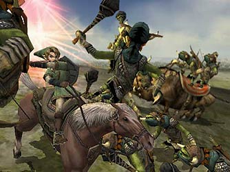
 With their next console Zelda, Nintendo wanted to avoid the polarization created by The Wind Waker‘s launch. The debut trailer for Twilight Princess, shown at E3 2004, hit the mark perfectly. I’ve already outlined its emotional impact at the time in an article published earlier this month. The sight of Link galloping across Hyrule Field, doing battle against the forces of evil on horseback, inspired a joyous uproar from gamers that helped propel the title to its immense commercial success.
Even when looking at the trailer with a more critical eye, it still surprises me with its quality. It allowed excitement to build before the audience even recognized it as a Zelda game. Link’s new ability to fight on horseback was trumpeted early on and the game’s mature tone remained consistent throughout. The fast-paced clips and soul-rising music kept the excitement building until the triumphant end. That of course was when Zelda creator Shigeru Miyamoto himself took the stage, the Master Sword in one hand and a Hylian shield in the other.
In some ways, this surprise E3 moment might have done too good a job. Twilight Princess, while an amazing game, doesn’t entirely live up to the epic expectations promised in its first trailer. I think even Twilight Princess devotees would agree that Link’s slow grind through Ordon Village early in the game doesn’t quite match the trailer’s nonstop action tone. Of course, a trailer can’t -and shouldn’t- tell us everything about a game. They are made to build excitement, and the first look at Twilight Princess more than succeeded in that regard. It saved enough key features, including Link’s wolf transformation, for future previews, and showed enough enemies and locations to fuel speculation. Zelda had reached its marketing apex.
Skyward Sword
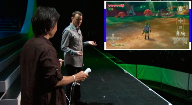
If the Twilight Princess reveal is one of the greatest E3 events in Nintendo history, gamers will undoubtedly remember Skyward Sword‘s unveiling as one of the worst. Debuted on the E3 stage of 2010, Skyward Sword almost immediately started off on the wrong foot. An unorthodox art style, this time mimicking the watercolor aesthetics of impressionistic paintings, once again caught fans off guard. Nintendo’s utter bungling of the gameplay demo, however, made the otherwise charming graphics much harder to swallow.
At the very least, Nintendo deserves credit for demonstrating pure gameplay from the get-go. With motion controls at the heart of Skyward Sword‘s identity, it made sense to dedicate the first several minutes of the press conference to them. Unfortunately, this came at the expense of presenting an exciting trailer. Instead we saw Link using basic items and sword techniques in a boring clip show before moving onto Miyamoto’s explanation of the Wii MotionPlus sword combat.
An embarrassing lack of skills on the part of Nintendo of America representative Bill Trinen, even if it was meant as a joke, started the demonstration off on a a sour note. When the controls started glitching out, however, while Miyamoto himself was at the helm, the presentation took an outright nosedive. Ultimately, it came across as a buggy tech demo, rather than the first look at a new console Zelda. Even the moderately exciting clips shown at the end, which displayed a slew of enemies and gameplay features, couldn’t save the showing.
Zelda Wii U
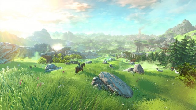
Our brief look at Zelda Wii U at E3 this year gave gamers a lot to anticipate. Eiji Aonuma personally introduced the game’s vibrant stylized visuals and open-world scope, letting us take in the sheer beauty of a Hyrule Field that stretched to the horizon. Having Link flee on horseback from the laser blasts of a robotic monstrosity gave the rest of the trailer an exciting cinematic feel. Nintendo, however, also neglected gameplay footage to a greater extent than even Twilight Princess‘s initial trailer. We saw nothing of how the game controls on the Wii U GamePad, which is arguably the system’s main selling point
Zelda Wii U falls somewhere in the middle of past Zelda reveals in terms of the excitement it drummed up. Nintendo played it safe this year to avoid unwelcome controversy. But they could have done so much more to hype the game and finally give consumers an unquestionable must-have Wii U title to look forward to. Details about the game came in scarce quantities over the course of E3. We didn’t even know if the effeminate blond youth featured in the trailer was actually Link for at least a day or two. When the gender of your main character is called into question, it probably means you need to paint a more complete picture.
Although Zelda Wii U’s first trailer offered only a few specific details, it at least finally put a face to the enigmatic project. It excited players with teased features and left enough unsaid to keep us guessing. As with every game, we must wait until we have a controller in our hands before we can accurately judge it. Until then, we at least have some indication that Nintendo is on the right track.
What did you think of Zelda Wii U’s debut at E3 this year? Has Nintendo sold you on the game already, or do you want to see more before you jump onto the hype train? Let us know in the comments below.


