
You are using an out of date browser. It may not display this or other websites correctly.
You should upgrade or use an alternative browser.
You should upgrade or use an alternative browser.
TPHD-Wii U Which version has the better box art in your opinion?
- Thread starter the8thark
- Start date
More options
Who Replied?


Fraxinus
chunky plant goop


I was never a fan of the particular promotional art they used for the WiiU boxart. It's far too gaudy, and adding Ilia and Ganondorf on top of it makes it even more so. It's literally color vomit. The original boxart was cool, though. When I was young and dumb, I didn't even notice wolf Link at first glance and thought he was part of human Link's hat/hair, lol. But that one is more artistically appealing to me; it's not overly busy but it gets the job done.
—Though, at least we didn't get another gold foil boxart. Those are literally the worst. Hmm... how can we make the boxart Zelda-y...? —I know! Let's make everything gold. That'll do the trick! Ugh.
—Though, at least we didn't get another gold foil boxart. Those are literally the worst. Hmm... how can we make the boxart Zelda-y...? —I know! Let's make everything gold. That'll do the trick! Ugh.
The PAL regions didn't get that gold box art for WWHD thankfully. But yeah I feel sorry for those who did.—Though, at least we didn't get another gold foil boxart. Those are literally the worst. Hmm... how can we make the boxart Zelda-y...? —I know! Let's make everything gold. That'll do the trick! Ugh.
My favourite TP box art is the original one. It fit the aesthetics of the game well. The promotional TPHD one as you've said is just too bright and busy.
misskitten
Hello Sweetie!
Wow the Japanese one really looks stunning, I have nothing against the new Box Art, but yeah I agree that the Japanese looks even better

oh easily the original
satan said it best,the new one looks like color vomit....still take that over the recent piss gold box arts
satan said it best,the new one looks like color vomit....still take that over the recent piss gold box arts

I have to say I prefer the HD remake box art. I always loved the contrast we got with Zelda and Midna in that piece, as it fits the themes of the game perfectly; Zelda has her head raised and is basked in light, while Midna has her head bowed and covered in darkness, which mirrors the game in an excellent way with the Twilight vs Hyrule conflict. Seeing the Japanese art makes me super jealous though, as just having Link and Wolf Link's head seems to not clutter up the whole thing as much as Wolf Link + Midna and Link + Epona do.
I will be getting the amiibo bundle, and it looks okay from here too.
I will be getting the amiibo bundle, and it looks okay from here too.


I just found the Japanese TPHD boxart. It looks way better than what we are getting.
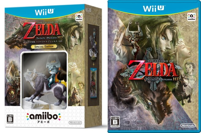
This is so the boart art we should have gotten.
I really like how that box art adds its own flair while remaining faithful to the original box design. Zelda always seems to have the best box arts in Japan. I still like the new box art for other regions, due to showing a lot of the major characters, but it's quite different from the original GCN/Wii cover.
I really like both the classic ones and the new wii u one, I love that Ilia is on the box art, I don't know what it is but it just gives the whole thing more personality and intrigue. I am not sure if I am a fan of Ganondorf being on the box art though, since I feel like it's kind of a spoiler for people who haven't played TP, I had no idea back in 06 that Ganon would come back so I feel it's going to take away the surprise a bit for those who haven't played it - I think they should have put Zant there instead. But it does look gorgeous!
Edit: - Now that I think about it - Midnas appearance is also kind of a spoiler, I remember being so surprised by how she looked and how beautiful she was at the end of TP but now it's already on the cover. Not a big deal though, like I said - it looks amazing!
I guess this game is intended for fans who wants to revisit
Last edited:
I love the original and the Japanese box arts. I agree that the new (I'm assuming US) box art for WiiU looks like a hodgepodgue of color and characters. Unless they make HD Twilight Princess significantly more vibrant, I don't think the bright green fits at all, plus the characters look out of place - It's not that I dislike Ilia and Ganondorf in the box art, but I think the very bold Link/Epona, WolfLink/Midna seem out of place to the background. I find the subtle colors and less spot lighted Link/Wolf Link to be much more appealing.
Doing this would utterly destroy the aesthetics, feel and look of TP.Unless they make HD Twilight Princess significantly more vibrant
- Joined
- Feb 17, 2015
I really like how that box art adds its own flair while remaining faithful to the original box design. Zelda always seems to have the best box arts in Japan. I still like the new box art for other regions, due to showing a lot of the major characters, but it's quite different from the original GCN/Wii cover.
I believe the original box art for Twilight Princess in Japan was different then the North American one. I could be wrong though. I always thought the NOA one was better.
I pretty sure this was the original Japanese box art. I could be wrong though.
.png)
Last edited by a moderator:
Terminus
If I was a wizard this wouldn't be happening to me


Does anyone have my first avatar? The one where Link and Wold Link's faces are all blended together? That would have made a much less cluster****-y boxart then the one we're getting.
Doing this would utterly destroy the aesthetics, feel and look of TP.
That was part of my point. I think the new box art doesn't really match the tone of the game.
Users who are viewing this thread
Total: 2 (members: 0, guests: 2)