• Welcome to ZD Forums! You must create an account and log in to see and participate in the Shoutbox chat on this main index page.

General Art Voting: GCC Week 4 - Free4All Avatars

Who's is better

  • LozzyKate

    Votes: 0 0.0%
  • Josie

    Votes: 0 0.0%
  • Dabombster

    Votes: 0 0.0%
  • TheGreen

    Votes: 0 0.0%
  • Axle the Beast

    Votes: 0 0.0%
  • Kybyrian

    Votes: 0 0.0%
  • Cooldogs_1

    Votes: 0 0.0%

  • Total voters
    0
  • Poll closed .
Joined
Sep 16, 2009
Location
Cali For Nuh
Sorry guys! Wasnt feeling well last night so I went to sleep before the deadline. Anyways here we go!

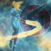
This week's theme was Free for All, contestants could pick any theme they wanted and create an avatar with it.

LozzyKate
Avatar.jpg


Josie
2hgvlw4.jpg


Dabombster
Whatever.png


The Green
GCC3Avatar.png


Axle the Beast
image.php


Kybyrian
ZeroSuitSamus.png


Cooldogs_1
image.php


Please vote for the one you think is the best! Good Luck to all entrants!
_________________________
GCC Week 5

Theme: Music
Medium: Sigs

Due: Saturday, September 25, 2010 @ 11:59PM PST
(-8:00GMT)

PM your entries to me & Good Luck
______________________________________
 

TheGreen

is climbin' in yo windows
Joined
Jul 12, 2010
Location
San Antonio
I think that all of the avatar's are too big :/ (except for Axle's and CoolDogs's)
LozzyKate FTW!
LozzyKate's avy is good, renders are nice, textures aren't overwhelming but are sort of vignetting the focus of the avy.

Boy there were a lot to choose from:
I think Axle's is quite nice. It's simple and small, but I can see the figure with good detail and the color scheme is nice. I just never got along with borders...
I also like Dabombster's. It changes the role of the texture from background element to the focus of the avy. And the negative space where the heart goes is pretty cool. But, I get lost on the quote. sorry.
Great job everybody!
 

Kybyrian

Joined
Jan 31, 2008
Location
Amherst, MA
Gender
Didn't I already answer this one?
I stole Bomby's heart [noparse]<3 <3 <3[/noparse]

I just kind of whipped mine up... lol

Found that render for up in the corner, grabbed a render, which was like the only appropriate one of Zero Suit Samus I could find. >.> Then I just stroked the background with some grunge brushes and overlayed it with a wireframe.

Lozzy's is very good. It's very simple but works very well. The dark edges at the top right make it seem less boring and the flare at the bottom left meeting with the tip is a really good combination of the render and the rest of the image.
 

Xinnamin

Mrs. Austin
Joined
Dec 6, 2009
Location
clustercereal
I'm torn between Kate's and Justin's. Kate did hers really well, the color scheme is very pleasing, and the border is done really nicely. Plus, it's seriously cute. Technically and artistically it has a lot of merit. Then Justin's (CD for those who don't know), something about the composition of the elements really jumps out at me. The textures, and the way that the Triforce fades out, something curiously eye-catching about it. Also very technically and artistically sound.

I'mma vote for Justin, if only because Kate's already in the lead anyways. But if I could vote for them both, I would.
 
Joined
Sep 16, 2009
Location
Cali For Nuh
Congrats to LozzyKate

Winner of Week 4's GCC!


Remember guys your Music Themed Signatures are due on Saturday!

Good Luck and Thanks for Participating!​
 

Users who are viewing this thread

Top Bottom