• Welcome to ZD Forums! You must create an account and log in to see and participate in the Shoutbox chat on this main index page.

Voting: GCC Week 2 - Pokemon Wallpapers

Who's is better

  • Chise

    Votes: 0 0.0%
  • Zenox

    Votes: 0 0.0%
  • Jebus_thecatman

    Votes: 0 0.0%
  • Kazumi

    Votes: 0 0.0%
  • Steve

    Votes: 0 0.0%
  • Beeker

    Votes: 0 0.0%
  • Xinnamin

    Votes: 0 0.0%

  • Total voters
    0
  • Poll closed .
Joined
Sep 16, 2009
Location
Cali For Nuh
ANNNNNNNNNNNNNNNND We're back Folks... With Week Two of the Graphic Community Competitions... And this week its some stiff competition as our artists duke it out with their Pokemon.

We have quite a number of talented artists.

Now before we begin, I'd like to note that your comment and Critique is wanted... These artists can only get better if YOU, yes YOU. Help them!. Tell each of them what they did good, tell em what they should improve on... That way they can grow as artists and get better too! (Not to mention that when the market feature opens, you will be reward for your good deeds)

Anyways enough Chitter Chatter... Lets meet our Contestants.
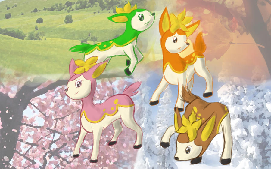
Chise
PokeWallPaper.png


Zenox
pokemon_wallpaper.png


jebus_thecatman
lucario800by600.png


Kazumi
wallpapperkaz.png


Steve
PokemonWallpaper.jpg


Beeker
pokewallcopy.png


Xinnamin
shikijika__seasons__by_bluegardevoir-d2xqh3a.jpg


Voting ends in 4 days, Please vote for who you think did the best!

Dont forget to comment and Critique!

-------------------------------------------------------------------------

ANNOUNCING WEEK 3!

Theme: Nintendo 64
Medium: Signatures (follow forum guidelines)

DUE: Saturday, September 11th, 2010 11:59PM
(PST) (-8:00GMT)


-----------------------------------------------------------------------------

GOOD LUCK!
 

Zelda's_Child

~Insert Epicness Here~
Joined
May 15, 2010
Location
Wherever I want to be
Arrrrgh im loving them all its too hard to decide!!!!!

In the end I voted for Steve's, because I thought the city was really clever!!! (unless a place like that really exists...o_O

Kudos to all of you!!!:P
 

jebus_thecatman

What the moo?
Joined
Mar 4, 2010
Location
a place somewheres
I putting my vote for Xinnamin, the pokemon that she hand drawn (well with computer, XD) look amazing. I also love the different backgrounds. I don't think there's anything needed to be improved on. Good job Xinnamin!!!
 

Kazumi

chagy
Joined
Dec 3, 2008
Location
Canada
I'd have to say that Chise's is the best. I really like the art she did, and I like how it's not to cluttered up, which makes it good for a desktop. It's definitely a lot better then mine.
 

February Eve

ZD District Attorney
Joined
Mar 21, 2010
Location
USA
I putting my vote for Xinnamin, the pokemon that she hand drawn (well with computer, XD) look amazing. I also love the different backgrounds. I don't think there's anything needed to be improved on. Good job Xinnamin!!!

Wait, did she draw those herself? I was kind of torn between Steve's and hers, but that could help tip the scales. So many nice ones, though. Everybody does a better job than I could with my (nonexistent) graphical skills. *claps*
 

Kybyrian

Joined
Jan 31, 2008
Location
Amherst, MA
Gender
Didn't I already answer this one?
What's up with Steve's? I swear that's just a picture of the city from Pokemon Battle Revolution... I think I see a few effects in there, but they hardly make a difference. You don't notice unless you look at the comparison. He's winning? Psh.

Anyway, I voted for Beeker, simple but nice. Good renders and the background works well.
 
Joined
Apr 5, 2008
Location
Chula Vista, San Diego, CA
I know I entered and I'm ashamed I didn't get to see the other entrants before I made mine, mine's horrible on comparison :P

Aside from Steve's, his is just the wallpaper from the official PBR site with a color effect. A sparkle here and there and he's winning ... I vote Steve cheated. :<

Everyone else's is amazing, though! Man, I wish I could re-enter.

I made mine how I'd want a wallpaper, simple. Everyone else's is over the top and makes mine look bad :(
 

Beeker

Wild Card
Joined
Jun 14, 2010
Location
Canadia
Anyway, I voted for Beeker, simple but nice. Good renders and the background works well.

Thanks:D.
I think I like simple, at least for a wallpaper. Clutter is not nice.

But wow, it's so hard to vote! I gotta say, all of these entries are amazing!
Chise's is one I enjoy. The drawing itself is very nice, and it is very clean.
But once again, I say, well done everyone!:clap:
 

TheGreen

is climbin' in yo windows
Joined
Jul 12, 2010
Location
San Antonio
I voted for Zenox's.
If I were to have one of these backgrounds, his would be the most pleasant. The ball has that cool lighting effect on it, but the ball it self has the outline which makes it look flat; they are contradicting!, but it still works somehow!

I also really liked Jebus's.
It's pretty simple, but i think the texture went just a little overboard. The concept is really cool though.
 

February Eve

ZD District Attorney
Joined
Mar 21, 2010
Location
USA
Chise: Super cute! I love the little igglybuff pokiing its head out from the cloud. The colors are simple yet bright. I don't think yours needs any changes, but for some reason part of me expected to see a pokemon image in one of the clouds.

Zenox: I actually quite like yours - simple can be quite good. I think the only thing I may have done differently would be to make the background color something else, so that it wasn't white on white. That may be personal preference.

jebus_thecatman: Really like the style of yours. Just out of curiosity, what was the text in that layer?

Kazumi: I am normally a fan of brighter, but I realized you were going for the "Pokemon Black and White" theme. (Took me a second to actually read the text. :xd:) Considering that, I'm a big fan of the style.

Steve: Really like the image you chose for that! I don't usually think of pokemon as "metro" but I like the overall idea, and the colors are nice.

Beeker: I like the way the background radiates outward from the pokeball. Overall the design is simple - which I like - but at the same time doesn't appear to have any empty spaces.

Xinnamin: You already know I like yours from our convo. It's cute and colorful and I know that the pokemon is seasonal, but I still like the way you used the background of each season for each form of shikijika.

All in all, good job everyone. I admire everyone's skills!
 
Joined
Sep 16, 2009
Location
Cali For Nuh
Chise: Super cute! I love the little igglybuff pokiing its head out from the cloud. The colors are simple yet bright. I don't think yours needs any changes, but for some reason part of me expected to see a pokemon image in one of the clouds.

Zenox: I actually quite like yours - simple can be quite good. I think the only thing I may have done differently would be to make the background color something else, so that it wasn't white on white. That may be personal preference.

jebus_thecatman: Really like the style of yours. Just out of curiosity, what was the text in that layer?

Kazumi: I am normally a fan of brighter, but I realized you were going for the "Pokemon Black and White" theme. (Took me a second to actually read the text. :xd:) Considering that, I'm a big fan of the style.

Steve: Really like the image you chose for that! I don't usually think of pokemon as "metro" but I like the overall idea, and the colors are nice.

Beeker: I like the way the background radiates outward from the pokeball. Overall the design is simple - which I like - but at the same time doesn't appear to have any empty spaces.

Xinnamin: You already know I like yours from our convo. It's cute and colorful and I know that the pokemon is seasonal, but I still like the way you used the background of each season for each form of shikijika.

All in all, good job everyone. I admire everyone's skills!

These are the types of posts I really like to see... C&C posts like these are the ones that will receive exp points when the market feature is updated :)
 

AaronX

One who sits
Joined
Aug 18, 2010
Location
West Valley City, UT
These are all great, but why is everybody voting for Chise? Drifloon wasn't even in any of the Pokemon games for N64! Aren't we supposed to vote for the one that fits the theme most?
 

Users who are viewing this thread

Top Bottom