
You are using an out of date browser. It may not display this or other websites correctly.
You should upgrade or use an alternative browser.
You should upgrade or use an alternative browser.
The Random Drawing Contest Round 47
- Thread starter Random Person
- Start date
- Status
- Not open for further replies.
More options
Who Replied?


I've always been a fan of Ryoga's art style. Another job well done.
Jeeeen, I love you, and your drawing is great but it needs more color and background detail.
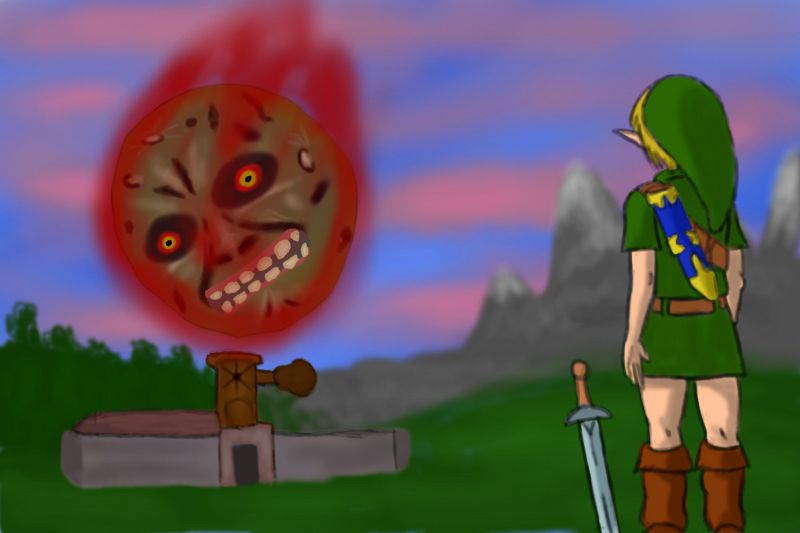
My vote goes to Patayha. Very well drawn, colorful, complete drawing. The background could have been less blurred but I understand the artistic decision to focus on Link, the moon, and Clock Town's impending doom.
Jeeeen, I love you, and your drawing is great but it needs more color and background detail.
My vote goes to Patayha. Very well drawn, colorful, complete drawing. The background could have been less blurred but I understand the artistic decision to focus on Link, the moon, and Clock Town's impending doom.
Sydney
The Good Samaritan


Patayha - Your design was the one I was initially thinking of when I heard the words "Majora's Mask" and "Failure", meaning I totally understand where you're coming from. The way you drew Link is superb, but I think the image overall lacks sufficient detail. Simple things, such as making the flames around the moon more vibrant, and taking the time to add blades of grass will make your piece stand out. Overall, though, I really enjoyed your piece.
GirlWithAFairy - I understand what you mean by failure, especially in this one. You could have added more detail into yours, but I won't complain too much about it. Although I will say that you should have added color, or at least some shading. Even though the concept is great, without shading or coloring it looks dull.
Ryoga - Unique as always, Ryoga. It took me a bit to understand what concept you were trying to incorporate, but I eventually understood it. Your detail is pretty impressive, and Tingle's expression is rather humorous. If I must mention one thing, I would say that I highly recommend not using markers to color with. Markers make things bold and stand out, and although that's good in some cases, it wasn't too much in this one. I'm not saying your drawing is bad, because it's most certainly superb, but you can clearly see the marker streaks throughout this piece. If anything, I would switch to colored pencils, or even copic markers if you're able to find them.
Overall, I'm torn with who to choose, but I think I'll go with Patayha. Something about it keeps drawing me back to it, and the more I look at it the more I like it.
Also, Random Person, don't mean to be so rude, but I believe you forgot to hand out awards for the past two RDCs.
Terminus
If I was a wizard this wouldn't be happening to me


Phataya: Only time in a game I've truly had a feeling of abject failure. Not sure about the art style.
GWAF: Nicely drawn but could use some color or shading.
Ryoga: I liked how you got 2 instances of failure in 1 sketch. Both Tingle's balloon (don't know what he thought when he went up) and the stone to Romani Ranch that seems so unbreakable...
My vote goes to Phataya because I can relate to that feeling of failure.
Raindrop14
Soldier for Christ!
Ha ha, funny thing, I was going to submit an entry, but I saw that the main theme was Majora's Mask, and I made a Wind Waker one. I made it day of (boy am I late for stuff...), so I didn't have time to change it. :\
Anyway, my vote goes to Ryoga. I think the concept is funny, although Patayha's was funny too. Gwaf's I didn't understand the failing aspect, but I haven't played MM in a long time, so that's just me. :bleh:
I want to submit one for next time, hopefully I'll get the right game!
I made it day of (boy am I late for stuff...), so I didn't have time to change it. :\Anyway, my vote goes to Ryoga. I think the concept is funny, although Patayha's was funny too. Gwaf's I didn't understand the failing aspect, but I haven't played MM in a long time, so that's just me. :bleh:
I want to submit one for next time, hopefully I'll get the right game!
Braivety
FPT | Breb
Yeah, I think I'm done with markers. :S
*M i d n a*
Æsir Scribe

All entries are awesome, but the third one gets my vote. Good job, everyone.  :)")
DekuPrincess
Are you serious?!?
- Joined
- Feb 6, 2013
- Location
- In a bottle
I really like all three! In the end I voted for Phataya's entry which has a very finished, polished look to it, and is a well executed representation of failure, imo. GWAF's is actually my favorite in terms of subject matter, but like other posters I agree that it needs either some detail, shading, or color--it feels incomplete. I also really like Ryoga's, it made me laugh, but because it made me laugh I feel like it didn't successfully convey a sense of failure in a grand sense like Phataya's does with the obvious (moon falling) and GWAF's does with the more subtle (Keaton's quote being applicable much more broadly than just the quiz).
Random Person
Just Some Random Person
Everyone did a really nice job, I don't have too many complaints about any of them. In the end, I wound up voting for Ryoga because while all three were nicely drawn, his concept was the more unique one. And when it comes down to it, uniqueness is one thing I look for most in art.
- Joined
- Jan 12, 2013
- Location
- Ordon Village
Pataya has my FAV =3
Random Person
Just Some Random Person
The winner is Ryoga with their entry...
.jpg)
- Status
- Not open for further replies.
Users who are viewing this thread
Total: 2 (members: 0, guests: 2)