
David
But you called me here...
- Joined
- Aug 6, 2010
Yes, I know that this is a few weeks late... but I've had 2 extremely busy and stressful weeks... But anyway, lets move on.
The tags that follow are the images created with the theme, Skyward Sword Signature tags. We had several entries, and all of them are pretty good. Feel free to take a look at them, enjoy them, and critique them. One of the main reasons we do these competitions is to improve the quality of the images that these artists create. So, lets look at the entries!
First, we've got one created by Hero of Time.
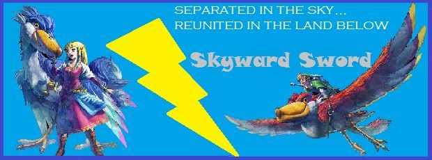
Its a nice image with some very basic effects, containing both Link and Zelda and their respective birds. As for my critique, I'd suggest reading some tutorials on text placement, c4d use, and brush use. With some practice, this signature can look much better. Lets give a round of applause for Hero of Time (applause).
Second, we've got one created by Josie.
Its another nice image with some decent brushing effects. My critique is to start expanding your use of brushes, and do some smudging to make some really cool effects around the render. I'd also suggest learning about other fonts. The Hylian font isn't suited for signature tags. There are many other fonts that flow better. How about another round of applause? (applause)
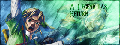
Third, we've got one by Zelda Human.

Its another image with some pretty cool texture effects. My advice is to use a texture that fits the colors of the render more. The dark brown doesn't really compliment the colors in the render. The text looks pretty decent, but I think that it takes away too much from the focus which should always be the render. Lets congratulate Zelda Human as well! (Applause)
Congratulations to each of you! Now, everyone else, vote for your favorite!
The theme that will be due in 2 weeks will be:
Pokemon Signatures
To celebrate the inclusion of Pokemon forums, lets have a Pokemon theme this time!
Entries will be due Saturday, October 15.
Just send them into me through PM.
The tags that follow are the images created with the theme, Skyward Sword Signature tags. We had several entries, and all of them are pretty good. Feel free to take a look at them, enjoy them, and critique them. One of the main reasons we do these competitions is to improve the quality of the images that these artists create. So, lets look at the entries!
First, we've got one created by Hero of Time.
Its a nice image with some very basic effects, containing both Link and Zelda and their respective birds. As for my critique, I'd suggest reading some tutorials on text placement, c4d use, and brush use. With some practice, this signature can look much better. Lets give a round of applause for Hero of Time (applause).
Second, we've got one created by Josie.
Its another nice image with some decent brushing effects. My critique is to start expanding your use of brushes, and do some smudging to make some really cool effects around the render. I'd also suggest learning about other fonts. The Hylian font isn't suited for signature tags. There are many other fonts that flow better. How about another round of applause? (applause)
Third, we've got one by Zelda Human.
Its another image with some pretty cool texture effects. My advice is to use a texture that fits the colors of the render more. The dark brown doesn't really compliment the colors in the render. The text looks pretty decent, but I think that it takes away too much from the focus which should always be the render. Lets congratulate Zelda Human as well! (Applause)
Congratulations to each of you! Now, everyone else, vote for your favorite!
The theme that will be due in 2 weeks will be:
Pokemon Signatures
To celebrate the inclusion of Pokemon forums, lets have a Pokemon theme this time!
Entries will be due Saturday, October 15.
Just send them into me through PM.
