• Welcome to ZD Forums! You must create an account and log in to see and participate in the Shoutbox chat on this main index page.

Breath of the Wild BotW aesthetics

Joined
Oct 14, 2013
Location
Australia
The Breath of the Wild Aesthetics (not graphics). Are you really pleased with them?

Personally I am on the fence. Over bright and over saturated was what instantly came to mind when I watched the trailer and some of the gameplay footage, but I assume that will change when I play the game. Today I can tolderate what Wind Waker looks like (even though I initially hated it), so I think in time I'll be able to tolerate the BotW aesthetics.

But what do you think of the BotW aesthetics?
 

Dio

~ It's me, Dio!~
Joined
Jul 6, 2011
Location
England
Gender
Absolute unit
The art style I think is decent. I dont have a complaint about it. Its not necessarily the HD Tech demo style I wanted but it is reasonable.

The graphics are not good however. There is clearly texturing present that is of poor quality it is noticeable on the rocks and also objects and scenes in the distance can look very washed out
screenshot_1-768.jpg


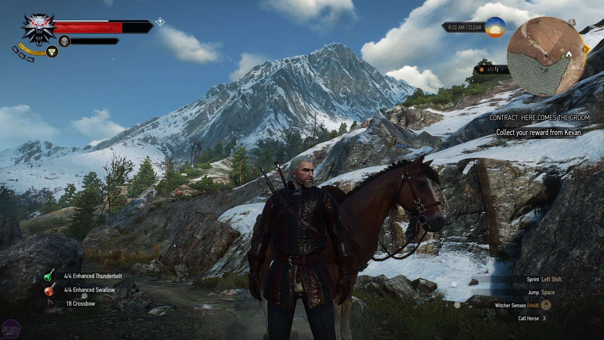
Compare that with a game with good graphics
the-witcher-3-wild-hunt-mountains.jpg


and you'll see what I mean. Anyone who says that BoTW had good graphics disregarding artstyle is just being a fanboy. They're wrong.

I hope NX BoTW looks a lot better.
 
Joined
Oct 14, 2013
Location
Australia
The art style I think is decent. I dont have a complaint about it. Its not necessarily the HD Tech demo style I wanted but it is reasonable.
This topic is about aesthetics and not graphics. I did specifically mention that in my first post. Still I'll respond to your comment here.

Your comparison in not exactly an even one. You need to get the guy in the second picture to be nedt to a cliff or mountain and screen shot that.
A better comparison is the top picture compared to when you mountain climb on foot in Xenoblade Chronicles X. XCX 's mountains and cliffs look way better, but it is a totally different aesthetic Monolithsoft were going for.

The graphics in BotW are not trhe greatest ever but that is totally off topic as we are talking aesthetics and not graphics here.
 

Dio

~ It's me, Dio!~
Joined
Jul 6, 2011
Location
England
Gender
Absolute unit
This topic is about aesthetics and not graphics. I did specifically mention that in my first post. Still I'll respond to your comment here.

Your comparison in not exactly an even one. You need to get the guy in the second picture to be nedt to a cliff or mountain and screen shot that.
A better comparison is the top picture compared to when you mountain climb on foot in Xenoblade Chronicles X. XCX 's mountains and cliffs look way better, but it is a totally different aesthetic Monolithsoft were going for.

The graphics in BotW are not trhe greatest ever but that is totally off topic as we are talking aesthetics and not graphics here.
Aesthetics would encompass graphics as it is basically 'the look' of the game. What I think you might be on about is art style.
I have chosen this picture to showcase the appearance of the rock texturing. Compare it to the Zelda picture you can see that it is quite a bit better.
witcher10-1920x1080.jpg
 
Joined
Oct 14, 2013
Location
Australia
Aesthetics would encompass graphics as it is basically 'the look' of the game. What I think you might be on about is art style.
Aesthetics is art style amongst other things.

Your new picture is a much better comparison. To that my responce is I agree with you totally. Much better graphics in Witcher. But that's too be expected. But I do think we will have a SFZ thing happening. As in the final game looks a lot better than the demo for BotW. Still I do not think BotW will even come close to Witcher or any other really good looking game. I do however think Nintendo know this and are working with that in mind.
 

Lozjam

A Cool, Cool Mountain
Joined
May 24, 2015
The art style I think is decent. I dont have a complaint about it. Its not necessarily the HD Tech demo style I wanted but it is reasonable.

The graphics are not good however. There is clearly texturing present that is of poor quality it is noticeable on the rocks and also objects and scenes in the distance can look very washed out
screenshot_1-768.jpg


Compare that with a game with good graphics
the-witcher-3-wild-hunt-mountains.jpg


and you'll see what I mean. Anyone who says that BoTW had good graphics disregarding artstyle is just being a fanboy. They're wrong.

I hope NX BoTW looks a lot better.
I think it should be noted, and correct me if I am wrong, but Zelda Wii U has a lot more moving parts than the Witcher.

The hundreds of blades of grass that sway with the Wind, so dynamically in a physics based engine is something I do not remember seeing that often with the Witcher.
The Witcher also has a lot of wildlife as well, just like Zelda BotW. That takes up a considerable amount of power.

Not only that, but Zelda u has quite a large draw distance. Of course, something like the Witcher does too. However, Zelda U has less pop in, than at least titles such as Horizon: Zero dawn.

Furthermore, the objects looking washed out, that is not graphical fidelity, rather, it is a conscious decision. This is to further the anime art aesthetic, of which as you get farther away.

Yes, some areas in Zelda Breath of the Wild do look rocky. However, this is to get a lot a moving parts working, so that other areas of the game(that aren't high rocky cliffs) look amazing.

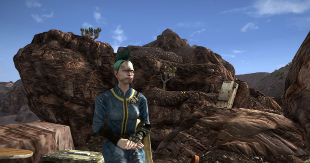
I would also like to add as well, that Fallout 4 has equally as bad textures in some places as well.
nv9.jpg


So Zelda Wii U largely matches the "current gen" standard. The Witcher was merely made of the cream of the crop.

But not only that, but Zelda BotW also does something unique aesthetically as well. In that there are so many moving parts throughout 90% of the game.
 

Viral Maze

Verb the adjective noun
Joined
Feb 5, 2010
Location
Canada
The graphics suck, but I'm digging the art style. I like the bright colours. It really makes the game pop.
The wiiu version is going to be mediocre in terms of graphical fidelity I bet but the NX version of it should definitely fix the the resolution, AA, texture and hopefully draw distances as its pretty bad.

The hundreds of blades of grass that sway with the Wind
You know each blade of grass isn't coded individually right?
 

Lozjam

A Cool, Cool Mountain
Joined
May 24, 2015
The graphics suck, but I'm digging the art style. I like the bright colours. It really makes the game pop.
The wiiu version is going to be mediocre in terms of graphical fidelity I bet but the NX version of it should definitely fix the the resolution, AA, texture and hopefully draw distances as its pretty bad.


You know each blade of grass isn't coded individually right?
Each blade of grass sways independently towards the environment. So yeah. By the game, they are considered each individual objects because they act independently from each other.
h2kl8KB.gif
 

Dan

Joined
Sep 19, 2011
Gender
V2 White Male
I like the graphics but the colours look a little washed out if anything. Those cliff textures are pretty ugly too, but Nintendo could enhance them before release.
 
Last edited:

Dio

~ It's me, Dio!~
Joined
Jul 6, 2011
Location
England
Gender
Absolute unit
I think it should be noted, and correct me if I am wrong, but Zelda Wii U has a lot more moving parts than the Witcher.

The hundreds of blades of grass that sway with the Wind, so dynamically in a physics based engine is something I do not remember seeing that often with the Witcher.
The Witcher also has a lot of wildlife as well, just like Zelda BotW. That takes up a considerable amount of power.

Not only that, but Zelda u has quite a large draw distance. Of course, something like the Witcher does too. However, Zelda U has less pop in, than at least titles such as Horizon: Zero dawn.

Furthermore, the objects looking washed out, that is not graphical fidelity, rather, it is a conscious decision. This is to further the anime art aesthetic, of which as you get farther away.

Yes, some areas in Zelda Breath of the Wild do look rocky. However, this is to get a lot a moving parts working, so that other areas of the game(that aren't high rocky cliffs) look amazing.

I would also like to add as well, that Fallout 4 has equally as bad textures in some places as well.
nv9.jpg


So Zelda Wii U largely matches the "current gen" standard. The Witcher was merely made of the cream of the crop.

But not only that, but Zelda BotW also does something unique aesthetically as well. In that there are so many moving parts throughout 90% of the game.
I don't know if you have played W3 or not. But the tree physics in that game are very impressive, you come across massive forests and the way the trees sway in the wind is just great and is dependent on weather. They've done it with the grass in BoTW but the trees do not appear to move as realistically and they are in much fewer numbers, so I wouldn't imagine that has anything to do with downgrading the graphics.
 

Viral Maze

Verb the adjective noun
Joined
Feb 5, 2010
Location
Canada
Each blade of grass sways independently towards the environment. So yeah. By the game, they are considered each individual objects because they act independently from each other.
You know they don't actually move or sway independently. They're programmed specially, and thanks to a little in-engine magic, they seemingly act independently. There is no way the game engine could handle hundreds of miniature blades of grass swaying, and colliding with each other. It doesn't require a lot of power like you stated, especially if they have a way to reduce the number of draw calls required, and have a way to streamline the computation of the movements of grass clusters as objects move through them, rather than just Link.

I would also like to add as well, that Fallout 4 has equally as bad textures in some places as well.
Highlighted the key words in there for you.

Edit: Correct me if I am wrong, but I'm quite sure rock textures are GPU limited, and the motions of the flora are CPU limited.
 

misskitten

Hello Sweetie!
Joined
Jun 18, 2011
Location
Norway
Wow, people are being rather negative. I don't need picture perfect realistic, in fact I think Zelda is better without it. I like the animé inspired look, the artisticness of it, and I think it looks gorgeous. It's bright and vibrant, yet nicely detailed, the sky and especially the sunrise/sunset is absolutely gorgeous, and I just know I'm going to have no trouble at all immersing myself into the game. I personally think it's the best looking Zelda yet.
 

Users who are viewing this thread

Top Bottom