Daily Debate: Which Zelda Game Had Your Favorite Graphics?
Posted on April 09 2018 by Adam Barham

As The Legend of Zelda series has progressed through the years, we’ve seen many different things change from game to game. Some different features and mechanics have come and gone; music pieces have been created, left behind, remastered, and then left behind again; we’ve seen many different characters enter in, stick around for a few games, and vanish.
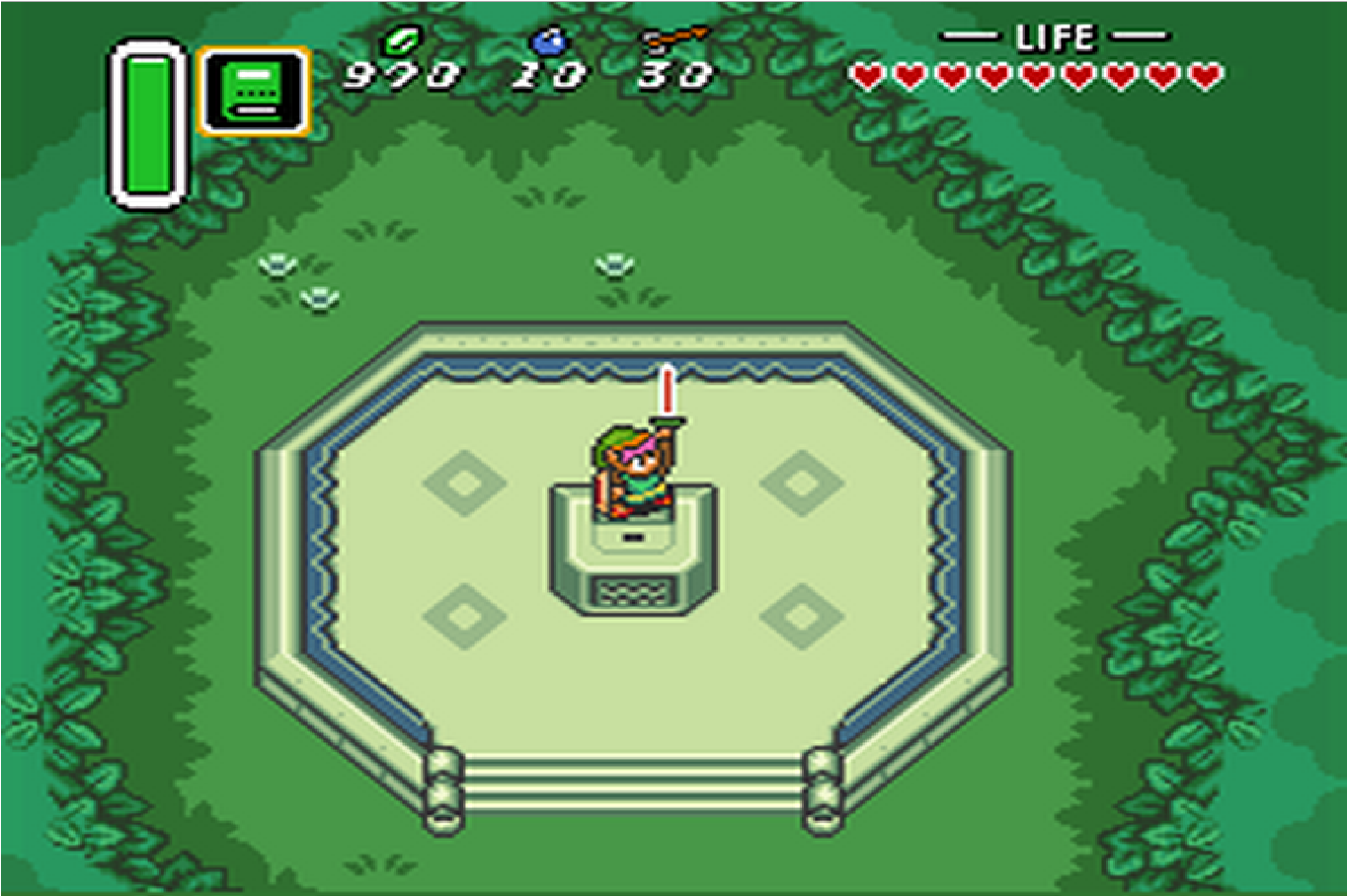
Another part of the series that frequently changes is the style of graphics. The Legend of Zelda has progressed quite a long ways from the early days of 8-bit Link, yet there’s still some charm in some of the older styles. One of my personal favorite styles of graphics was from A Link to the Past, though most of my reasoning for that is simply nostalgia. The Nintendo 64 entries were the first 3D Zelda games, and while they have a nice appearance in their own ways, the early attempts at that style tends to show, especially as graphics have advanced over the years since their release. The Wind Waker had one of the most cartoon-like styles in the series, Twilight Princess had one that was aiming for something more realistic, and Skyward Sword had one of the most colorful.
That’s not even touching on the portable entries, which each have their own charming graphics. The Gameboy entries all shared the same retro graphics style. The GBA games also shared graphics, and while they were still more retro than most modern games, they were more colorful and charming than some of the older entries.
Even the games that I didn’t mention have their own enjoyable styles. From the older pixelated games to the modern entries with high-quality 3D models, The Legend of Zelda series has had multiple different changes in graphics over the decades, while still managing to keep an overall theme. With that in mind, which Zelda game had your favorite graphics style? Leave your thoughts and opinions in the comments below!


