Daily Debate: Which Zelda Game Had the Best Box Art / Packaging?
Posted on September 03 2018 by Rod Lloyd

The Zelda series has always knocked it out of the park with its games’ box art and external packaging. The talented artists of Nintendo have time and time again delivered an inviting and endearing glimpse at the adventure that awaits in each title, whether they present a striking mural / collage of characters and set pieces, or they represent the class and majesty of the Zelda brand through a gold-centric design. But we can’t have a debate if we all agree that every Zelda‘s box art is great; we have to decide which game the best.
When thinking about this question initially, my thoughts jumped to the Zelda game packaging of my youth. I always thought there was something magical about the golden box of Ocarina of Time and the dark packaging of Majora’s Mask. But after a quick Google image search of more recent Zelda boxes, I think I’m even more smitten with the art on these more contemporary games. For example, the new artwork present on the cases of The Wind Waker HD and Majora’s Mask 3D are just grand. I really appreciate the way these pictures show off each game’s cast of characters and give a general impression of each game’s setting. I also quite enjoy Breath of the Wild‘s box art in both America and Europe. Both pieces perfectly represent the game’s open-air design and emphasis on exploration, and I predict that both images will be considered iconic in just a few short years.
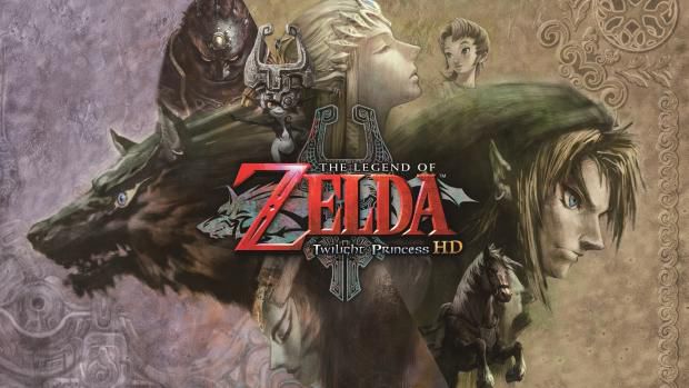
But ultimately, when all is considered, I think my favorite piece of Zelda box art is from the European release of Twilight Princess HD. An updated version of the artwork seen on the original Twilight Princess, the HD cover features many of the game’s central characters, including Ilia, Ganondorf, and Midna. The image’s design does a good job of establishing TP‘s darker tones, and it hints at the imminent clash between Hyrule and the Twilight Realm. It’s a really cool visual, and I personally see it as the best piece of Zelda box art.
But which game do you think has the best box art / external packaging? Do you enjoy the simpler designs seen on Zelda I or Zelda II? Do you like the box art of a more recent game? Is there a special edition box or cartridge design that struck you? Share your thoughts in the comments below!

Rod Lloyd is the Editor-In-Chief at Zelda Dungeon, overseeing the news and feature content for the site. Rod is considered the veteran of the writing team, having started writing for Zelda Informer in 2014 as a Junior Editor. After ZD and ZI officially merged in 2017, he stepped into the Managing Editor role and has helped steer the ship ever since. He stepped up to lead the writing team as Editor-In-Chief in 2023.
You can reach Rod at: rod.lloyd@zeldadungeon.net


