Analyzing The Wind Waker’s Art Style
Posted on September 06 2012 by ralphpotato
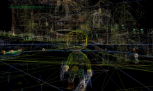
 One decade: ten years, or nearly so. That is the length of time that has passed since The Wind Waker was released to the Japanese public, but the cel-shaded art style of the title seems to transcend time, and it’s hard believe The Wind Waker hit the shelves so long ago. Though some people prefer a more realistic graphic style, a lot still went into making The Wind Waker look really good. To fully appreciate this, an analysis would be helpful. And this is exactly what Polycount forum member warby has done. Hit the jump for more!
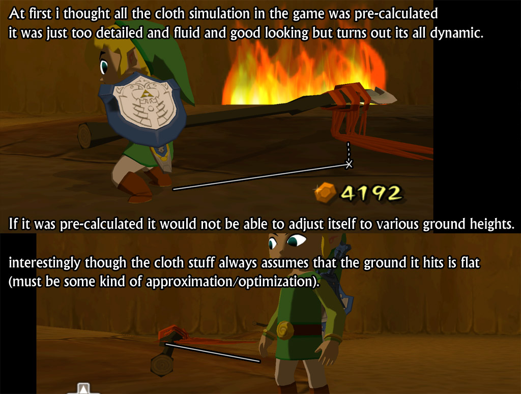
One example of a great attention to detail is the dynamic rendering of the clothes in game.
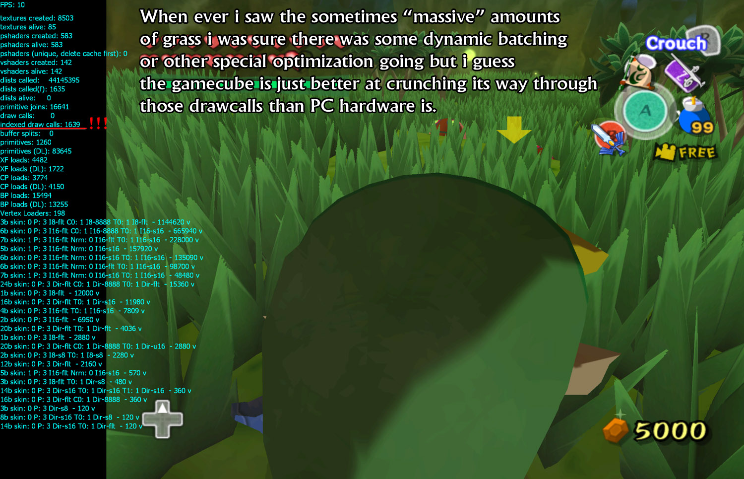
There are also examples that show the GameCube rendering better than PC games!
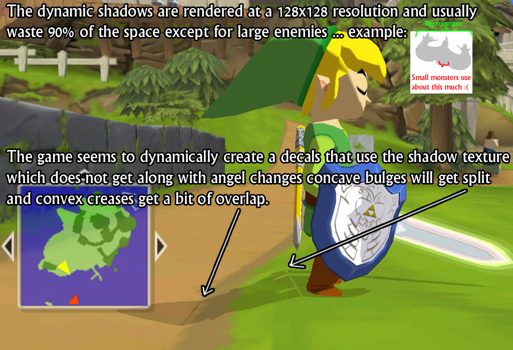
There are still some drawbacks, however, and corners were clearly cut in some areas.
To see the full analysis, head on over to the Polycount forum post.
A bit more behind the scenes than you might have expected; that was certainly the case for me. I’ve always considered The Wind Waker’s art style to be simpler, but in many ways better, but this might have changed my mind about it being “simple”! What do you think? Comment down below!


