A Link Between Worlds – artwork comparison
Posted on August 10 2013 by Michael
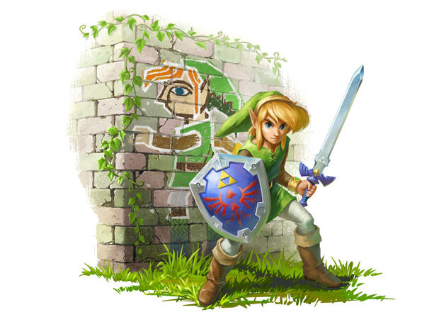
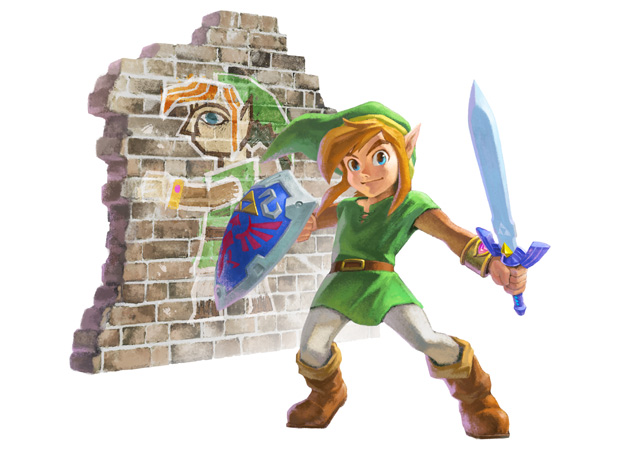
 Back at E3 2013, Nintendo showed off a new piece of artwork for A Link Between Worlds. The artwork was a simple piece depicting Link standing by a wall to show off the newest feature of the game–travelling in walls. Nintendo released a remake of the artwork a few days ago. The biggest change in the artwork is Link’s appearance.
Check out both pieces after the jump!
This is the artwork released at E3:

This is the remake of the artwork Nintendo recently released:

Personally, I think the E3 version is the best. It grew on me over the past couple of months. I’m sure the remade version will grow on me in time soon. It already has a nostalgic feeling about it. It sort of resembles the Link from the NES games. Which piece is your favorite? Let us know in the comment section below!
Source: TinyCartridge


