• Welcome to ZD Forums! You must create an account and log in to see and participate in the Shoutbox chat on this main index page.

Zelda Art Voting: GCC Week 10 - Majora's Mask Wallpapers

Who's is better

  • Beeker

    Votes: 0 0.0%
  • TheGreen

    Votes: 0 0.0%
  • Kazumi

    Votes: 0 0.0%
  • Kybyrian

    Votes: 0 0.0%
  • TheSkywardSword

    Votes: 0 0.0%
  • FierceDiety

    Votes: 0 0.0%

  • Total voters
    0
  • Poll closed .
Joined
Sep 16, 2009
Location
Cali For Nuh
And welcome to week 10 of the Graphic's Community Competitions. This weeks theme was Majora's Mask Wallpapers.

So let's meet our contestants.

First we have...

Beeker
MysticBeekah
MMWall.png


TheGreen
MajorasMaskWallpaper.png


Kazumi
majorasmaskwallpaper.png


Kybyrian
majorasmask.png


TheSkywardSword
attachment.php


FierceDiety
2i7o8pe.jpg


You have 4 days to get your votes in... Please leave a critique (you will be rewarded).

-------------

Announcing Week 11
In honor of the celebration of Majora's Mask Month, we will continue with the theme

Theme: Majora's Mask

Medium: Signatures

(creations must be made by you sometime this week... you may not use prior art)

Deadline: Saturday, November 6, 2010 @ 11:59PM PST
(-8:00GMT)

-----------------


TheGreen

is climbin' in yo windows
Joined
Jul 12, 2010
Location
San Antonio
Quick critique:

Beeker:
I think the wall paper is well composed. The renders all looks very nice. It's all just too washed out :/ I get that there's a coloring going on, but I think that coloring should vary between the background and the renders. It's like there's a fog I'm stunk in. Also, I'm a little bummed that you include only 3 of the 4 transformation masks.

TheGreen:
In retrospect. It's a little bland. I do like the micro vs. macro thing going on, but the big black line is a little too much. Not busy, which is good, but it's not eye catching either.

Kazumi:
It's pretty cool, and I think that if this were a desk top then it would be more immersive and look a little bit better, but as it stands it's just too hard to see. The fog is nice, but you hve to be careful with it, cause Majora's Mask (the actual mask) in the logo looks tired or like his eye lids are closed half way XD

Kybyrian:
I think it's good. You've colored the render without letting it blend into the background. The contrast is good. I like all the little textures, but I think there are too many things going on. The floating squares are really what turn me off, but perhaps the best functional desktop of them all.

Skyward Sword:
I like that you included the transformations as well as Link, and the subtle Mask is nice. The mask is a little flat, but it works. The fog is distracting and it covers Link up quite a bit. I think that were Link's layer in front of the fog it would read much better.

FierceDeity:
u gawt mah vowt
The art's cool, the color scheme is cool, the text is cool, but I think using text is a cheap way to grab attention. The textures are probably the stronges part of the piece, they don't really fit though. It's like 4 differnt things going on and they don't flow together all that well except that the 'fierce deity' text kind of matches the black ink splotches. Also, the scirbble text needs to be spaced out so I can see what it says. So far I have "TO BECOME A_____..........ISN'T THAT gRAND?"
 

Zelda's_Child

~Insert Epicness Here~
Joined
May 15, 2010
Location
Wherever I want to be
I'm sorry I can't evaluate them all, Maybe I'll just say some small points they need to improve on.

Beeker:
You got my vote. I liked everything about it, except that Deku and Goron Link looked a little far down, and I don't think you showed enough of their faces...

TheGreen:
I liked yours, but the focuses confused me. How the background was blurred, but not blurred. It made me feel kinda weird...

Kazumi:
Very well done, but a little dark for me. ;) If I was that kind of person... I would definitely vote yes! ^^

Kybyrian:
Interesting concept, with the masks going back. But that was its only fault. The masks didn't really catch my eye... but the background absolutely BLEW ME AWAY. It's incredible!! ^^

TheSkywardSword:
Now that I look at it, I do agree with TheGreen. The fog is a little overpowering, and the mask is also a little too transparent. But good anyways... ;)

FierceDeity:
What can I say. It's amazing. ;) It's only fault with me is that its a bit too crowded. but otherwise, ABSOLUTELY AMAZING!!! ^^
 

Tony

Stardust Crusaders
Joined
Feb 15, 2010
Location
Seasons in the Abyss [Minnesota]
Beeker: The characters were transparant but still great
The Green: It's really just not my style but it looks wonderful
Kazumi: I love this one I just wish it had more.
Kybyrian: I liked the color scheme I just am not fond of the digitalization
The Skyward Sword: A little overpowering with the fog
Fierce Deity: We have a winner just a little crowded
 

Xinnamin

Mrs. Austin
Joined
Dec 6, 2009
Location
clustercereal
Beeker: Great concept, but not the best execution. Granted there aren't a lot of diverse renders to work with, but the inconsistent quality and the blurry Skull Kid do hurt the overall look of the wallpaper. If you could find better renders it'd be great.

TheGreen: Nice and bold, but it doesn't flow too well, and I'm not really all that sure what the bg is supposed to be. It's a bit too bold and just doesn't feel quite unified enough.

Kazumi: Epic concept, love the fog, but it's a bit overdone to the point where it almost loses any real focal point. A little more color and wouldn't hurt.

Kybyrian: I love the effect of the multiple masks, though the effect may have been a bit more pronounced if the back masks were more transparent? Love the unified color though and bg effects though, flows great.

TheSkywardSword: A big generic, and doesn't flow that well. Renders are all different sizes and inconsistent, somewhat distracting actually, but I love the transparent Mask in the bg.

FierceDiety: Is that manga art I spy? Props just for that, love manga art, but for a wallpaper it's really overly crowded. The text is also a bit hard to read. Overall I really really like the artistic value of the composition, but it just doesn't work too well as a wallpaper.

My vote goes to Kybyrian.
 
A

AlucardMAXX

Guest
Beeker: Good Job! I like it, but Skull Kid is a bit blurry and the image itself is oversaturated with characters
TheGreen: I really like this one, Overall, it is simple and enjoyable at first sight :D
Kazumi: You get my vote, pal... I LOVE the job you made. Very Good, I made one similar... maybe I'll post it later
Kybyrian: I like it... This is a futuristic-like design, and is pretty cool :)
TheSkywardSword: Sorry my friend... I don't like it... I only see some renders with a green background... Maybe some transparencies and layer effects could power it up ;)
FierceDiety: This is my 2nd favorite :D pretty awesome, but... A bit overcrowded... and looks like a street NY graffiti...

Hope this tips could help you guys!
 

Hachi

Happy Valentines Day!
Majoras Mask wallpapers! I must say I'm a bit.. surprised that only two of them are purple. XD

Alrighty, time for some feedback!

Beeker- Your composition is really not bad at all. With a bit of work it could be a usable wallpaper. All the renders on the outside are clear and sharp and really grab you which is great. The one thing that is throwing me off about it, and it's sort of a big thing- the render you choose in the middle is really weak compared to the others. It feels blurry (Although I'm not sure it really is, or it's the transparency setting that's doing it) and just isn't as strong as the pictures on the border. Going back and tweaking the opacity and such I think would do the wallpaper a lot of good.

There are also a few things that could be polished a bit better as far as the cutting out of the renders go. On the part where you erased links arm, there are a few white specks on top of a patch of green by his cheek. Also with the Zora render his fin is cut off. This is going to sound a little nit picky, but when someone has a wallpaper for long enough I guarantee you they would eventually spot these little imperfections. Like I said, composition is great and your color choices are more than appropriate for the mood that the game conveys, it's just a few elements that need some work. Keep it up though! <3

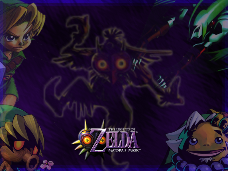
The Green- You're one of the few that went for a really bold look. Props on that, however the finished product quite frankly doesn't look complete. No one element in the wallpaper is bad, but they all seem at odds with each other. There is the sharp pastel colored patter background underneath the blurred Majora "spike", and then on top of that is a render of Majoras mask that isn't the best of quality (not that it's blurry, but moreso the scanner noise) and then it has a very sharp stroke around it. The picture just needs to be more unified. With a bit of work I think you could produce a good wallpaper with what you have (maybe put the background on top of the spike, and tone down the transparency a bit? Or even changing that pastel purple and replace it with a bolder color pulled right from the mask instead.)

Kazumi- I really like the simplicity of your wallpaper and think your entry would be a really great functional wallpaper. <3 However... It's so dark! I sort of have the same problem in the opposite direction, (Been told more than once my stuff is too light), and the reason this is an important problem to address is simply that most peoples computer screens are not properly calibrated. Most of the time this isn't a problem, but if your image is really light or dark it could come up looking even more extreme than it really is on someone else's screen. With a wallpaper its especially bad since the whole point of making one is to have people use it. >: Work on adding some real contrast to the picture and you've got yourself a winner.

Kybyrian- Even though you repeated it you only used one render, and I think you really used it effectively. The masks gradually getting bigger reminds me of the opening screen where Majora's Mask comes out of the shadows, and the background colors and textures are very reminiscent of the arena you battle majora himself in. The only huge complaint I have is there could have been more care taken in cleaning up the edges of the mask. There are still quite a few spots of white pixels just... making it not look as polished as it should. It takes a little more time to get rid of those yes, but it really does make it look much more complete. Still great job! > 3<

TheSkywardSword- Little hard to critique when it's so small. ;-;'' It looks a bit simple, and the smudgy white is a bit distracting, but otherwise it looks OK. I find it interesting that you and Beeker had very similar wallpapers. Just remember to submit it full size next time!

FierceDiety- OK... I can see the appeal of this wallpaper. However, if your going to be so bold with your typography you have to make sure of a few things. First off the most important thing is readability. If it was being used decoratively in the background or something then that isn't so important, but the fact that the text takes up about half of your wallpaper means you REALLY need to make sure it's readable. Right now it just isn't though, the white text is just jumbled ontop of eachother. And while it's practically begging to be read the decorative font is working against you by making it even more difficult to decipher. Also... why did you blur like the biggest part of your text? ;-;'' It would have been so strong if you had just let the font do it's thing and be grudge and in your face! You could still have done the blurred white stroke behind it to make it really stand out, but blurring the actual front is making it stand out in a bad way.

Everything else is fine, possibly playing with making patches of the background shaper in some areas. It could make for an intresting effect. Next time though... really be careful about the effects you throw on your type, as well as the placement. >:'

Overall nice turnout everyone! I'm sorry if my comments come off as overally critical, I do try to praise what everyones done well along with the the more critique-ie side of my post. ;;'
 

Random Person

Just Some Random Person
Joined
Feb 6, 2010
Location
Wig-Or-Log
Beeker - Out of all these I think yours best shows the representation of MM. If you could move the deku scrub and Darmani-Link up some, it would be better. Also, the fading aspect should have been thought of a little more carefully. There doesn't seem to be a good balance of it.

TheGreen - Wasn't too fond of yours. It looks like you put some work into it, but I'm not really a fan of this type of artwork.

Kazumi - Wound up voting for you. No complaints at all. Yours is beautiful and well done. The theme that you chose doesn't fully show the full grasp of MM, but that's not necessarily a requirement now is it? So long as it's MM related, you're good.

Kybry... Kyby... Ky - Yours is beautiful too, but a little too simple for my vote. You have a lot of open space on the sides of the mask which is a shame because I'm sure you worked hard on the background. Maybe incorporating the moon or something would have given it more of an edge.

TheSKywardSword - Pretty good. I wish you had shown more emphasis in the mask. It's a little too faded. The background also seems a bit too simple

FierceDiety - No complaints, just not my prefered choice. I'm not sure what the words mean, but that in no way brought down points for you. What you've done is beautiful and you should be proud of it. Even the way you've portrayed Tatl is completely epic.
 
Joined
Sep 16, 2009
Location
Cali For Nuh
Congrats to Fierce Diety. He is the winner of this week's GCC!

Please do not forget to send me your entries for next week!

I look forward to seeing them. And have a splended Majora's Mask Month!
 
Joined
Sep 16, 2009
Location
Cali For Nuh
Yes you do not need to sign up, sending me your completed entry is your 'sign up' So feel free to send me a MM signature by tomorrow night and you'll be all set!
 

Users who are viewing this thread

Top Bottom